Thursday, December 30, 2010

Riffing and Sampling

I am almost done with my newest still life. I have decided to do a few small paintings that borrow from the larger still life. I like the idea of paintings moving out into sequels or spin offs. They do it in TV all the time. So far, much like TV the spin off is not as good as the original series.


Soldier at the Crossroad, 5 x 3 1/4, oil on linen, 2010

This is not the best photo of the painting, but you get the point. Once it is dry I may scan it so it can get a better image. 
This is an army man that my wife found digging in the garden. I have a bag of my own army men from when I was a kid, but this one is older and more interesting. I have a box of old match books and picked this one for two reason, the color went well in the scene and I thought the tomato sauce looked a bit like blood. So it gave this war scene a touch of blood and guts. Of course something that I don't think kids think about when they are blowing up their toys.
I will tell you that today's firecrackers do not do the damage that I remember then doing. I was lighting them in the studio thinking of doing a before and after, but really all a firecracker does is make noise and throw pieces of paper all over the place. 
Do you think this painting is too political?


Do kids still blow up their plastic army men? I imagine there is probably a computer game or I Phone app that does it for them. Though looking back on the stupid stuff we did when we were kids I occasionally am surprise I have both my eyes and all my fingers and a computer version would be much safer. 
 

Thursday, December 23, 2010

He Framed Me

The frame for my newest painting was completed this week. I dropped by the framer's shop the other day for a test fit. Now I just need to finish the painting- which is very close.


Above is Joe Stewart masterfully placing the frame on the painting. Joe Stewart is a local home builder that has in the last few years began painting landscapes himself. He builds fine Arts and Crafts furniture and his frames are right at home hanging over those pieces. For years my wife has been yelling at me that my paintings don't always need a gaudy gold frame with all the fru fru. She kept pushing for dark wood frames. Of course I could not listen to her advice immediately. I had to wait a few years, until it almost seemed like it was my idea.
For this new painting I decided to go with a dark wood frame. I selected a warm silver liner that goes well with this painting which is primarily cool. I ordered the liner from Rottinghaus frame shop which I then gave to Joe so he could build the frame around it. He has a good selection of moldings, most of which are cut from quarter sawn oak. He could put together pretty much any thing you need including frames made for diptychs, triptychs and quadruptychs.

Here are a few more of his moldings and some of the finishes he offers.

He uses aniline dyes to stain the wood, often using multiple coats till he gets the tone he wants. The frame is coated with a thinned shellac and then rubbed with clear or colored waxes, which are buffed out to beautiful deep finish.
If you would like to order a frame I suggest you call him. He does custom work, and they are very affordable. He is also willing to build a house to go around your new frame if you are interested. It is a considerable up-charge, but I think if you need both a frame and a house, he may offer some sort of deal.
To purchase these frames, contact Rottinghaus Gallery and ask for the Joe Stewart line of frames. 513-871-3662

Thursday, December 2, 2010

Panorama of Cincinnati Art XXV

A panorama is any wide-angle view or representation of a physical space, whether in painting, drawing, photography, film/video, or a three-dimensional model.

I am honored to have been selected for Cincinnati Art Galleries 25th anniversary Panarama of Cincinnati Art.


 Father and Son (diptych)-22x28- oil on linen 
 

There are two reasons I am sure this show will be fantastic. For one thing the title ends in -orama. Secondly, most of the paintings are by the "Old Masters" of Cincinnati painting. The list includes Edward Potthast, Joseph Sharp, and John Weis.  This is an Artorama of great art by wonderful dead painters. I have been quite vocal of my support for and love of dead painters. They have done the best art in the Western world and it is a club I hope to be part of in the future. In fact I have pretty much  guaranteed it

The opening is this Friday. It cost $100 a person and will benefit the Museum Center. Now as much as I think it is completely fair for you to have to pay money to see my work, you can check Panorama for free the rest of the month. If you buy my paintings a percentage also goes to help the Museum Center. It's for a good cause. If you do go to the opening, I imagine  there will be wine and cheese. I don't know if there will be entertainment, but for the 25th anniversary, if it were up to me, we would celebrate Panorama with the band Bananarama. That would be incredible.

Anyway, below is the information about the show.


Panorama of Cincinnati Art XXV
Over 100 works
by Cincinnati's most famous artists 
from 1850 to the Now.

Opening Reception Friday, December 3rd from 5:00 - 8:00pm
$100 per person (payable to Cincinnati Museum Center)
Located at 225 East 6th Street, Cincinnati OH
Please call Sarah at 513-381-2128 for reservations
*Ticket sales as well as a portion of all painting sales during the month of December will benefit Cincinnati Museum Center. The exhibition and sale will open free to the public Saturday, December 4th and will continue through December 31st. All items can be viewed on our website after December 3rd at www.cincyart.com Color catalog will be available for $20.

Sunday, November 28, 2010

Don't Shush Me!

In the last post I told you about the Secret Artworks Sale that I was participating in. I am sure it was a big success, and thought I would show you a photo of the work I donate for the cause.
Copy of The Girl in the Black Hat by Frank Duveneck, 7X5, Oil on panel.


This is a little copy I did of a Frank Duveneck painting called Girl in a Black Hat.
This painting was actually a result of experimenting and playing around with a more earth toned palette for painting portrait. A few colors suggested to me by Carl Samson who using them to great effect in his work. I am used to a very chromatic palette, with no earth tones. So it has been a struggle for me to figure it out and work them in comfortably. This exercise was very helpful to understand the benefits and limits of each color.
I did a test canvas using all the colors in various mixtures. These extra colors are: Greenish Umber, Burnt Sienna, Indian Red, Light Red, and Vermilion. I just tested the colors with white, and then all the others on my palette, then started using the colors to work up a thickly painted copy in the corner.I strongly suggest that everyone do this with their colors. It is a good way to get to know your palette of colors.

Thursday, November 18, 2010

SHHHHHHHHHH

I am participating the Secret Artworks fundraiser again this year. I can't make it this year, so you will just have to go without me. Don't let that dissuade you, if you buy the card that I painted, I would be more than happy to get together and then let you take me out to lunch. So, that is an added bonus. Actually you do not have to purchase the card I painted. I am more than willing to let any of you buy me lunch.

I posted a few of my Secrets cards from years past.

The idea, 5 x 7, oil on card- My secret from 2006 
Selected as one of the top 100 

5th annual Secret ArtWorksFriday, November 19, 2010
6 - 9 p.m.
Westin Hotel Ballroom, Downtown Cincinnati

TheSecret ArtWorks is a fund raising event featuring the exhibition and sale of 5” x 7” works of art from local, national and international artists. All works of art sell for $75 each. The ‘secret’ behind each piece is the identity of the artist – which is revealed after the work is purchased.
Admission: $125 (single), $150 (couple).
Includes one Secret Work of Art, appetizers, beer and wine, and entrance to the event.  All Art Vouchers will be held at Check-In on the night of the event.  Art Vouchers for additional Secret Works of Art available at $75 each.

Secrets are out! You can view the Secret Works of Art here.  Click here.
I have just one card in the show this year. If you want a hint, mine is one of the better ones.

Bunny and his Peeps, 7 x 5, oil on canvas, 2007
 Selected as one of the top 100

Monday, November 15, 2010

The Weekend

The Indian Hill Art Show on Friday and Saturday went pretty well. The show was not only a bit more selective, with fewer artists, they laid it out in a more open and comfortable arrangement. It was fairly well attended, but very crowded on Friday night. I had a great time getting to know some of the artists. I want to thank everyone that came out to visit stop by my booth. It also helped that I sold a few pieces and made some nice connections.

Yesterday my family had an early Thanksgiving get together. My wife (in the above photo) and I drove to my parents house extra early so we could paint before the feeding frenzy. My mother and father live in a very picturesque farm community about 1 1/2 hours north east of Cincinnati. It is an open area surrounded by rolling fields with distant tree lines. There are various out buildings, barns and farm equipment around with which to compose a picture. I found dozens of possible pictures as I strolled around the farm looking for a spot to paint. I first settled upon and started a painting of barn full of tobacco hanging to dry (also shown in the photo above). The light effect changed immediately and became less interesting. Making a fast decision, I threw in the towel immediately- well, after about 30 minutes of getting in the big shapes.  I scrapped it down, wiped it out, and moved to a new spot to start anew. Facing the opposite direction, everything was being pounded with sunlight. This time the painting came together quickly and it was an absolute joy to paint- except for the wind- which blew my easel over as I stepped away to get some more paper towels. The easel went upside down, brushes and paint tubes went everywhere. The painting and palette fell face down in the grass. This is generally frowned upon in plein air work. It all cleaned up pretty well. I had to scrap dirt and grass out of the sky area and clean up a smear or two. Not too bad really. The only disaster was that all my turpentine spilled out on the ground. Laura was nice enough to give me some of hers.
An Early Thanksgiving, 12 x 16, oil on panel, 2010
After a little less than 3 hours I ended up with this. A cloudy morning had cleared way for clear blue skies. The light was incredible. With the dry summer I was not sure what the fall would look like, but the leaves this year are lovely hot reds and oranges. Everything seems to be glowing. I just hope the trees survive the continued drought.
I also got to try out some big, flat bristle brushes that I just purchased. They were very useful for carving out the big planes and chiseling out the form. Today I spent some time in the studio tweaking the drawing, cleaning up  sloppy edges and strengthening effects. I am pretty happy with this one. Probably one of my better one shot landscapes.

I love painting coffee cups almost as much as I love drinking tremendous amounts of coffee. Coffee cups have a romance to them and often have a graceful shape that is a challenge to draw. I enjoy using just a few simple objects to create little abstractions that will be pleasing not just as a recognizable objects. They become little arrangements in color and value. I recently bought a lovely Jadeite coffee cup in an antique store that I knew would be fun to paint. After trying a few things, I chose a pink table cloth  and a gray background which produced a very pleasant color scheme.The goal was to paint something fairly quickly for the show- usually a bad idea to have that as a goal. As is often the case I ended up working on it a bit longer than I anticipated. After spending the weekend with it hanging in the Indian Hill show I knew it needed more work. It was a bit lack luster and needed more color vibration so I went back in today. I may go back in on the steam. It looks a bit fake at the moment.
 Study in Gray, Green, Pink and Decaf, 7x5, oil on linen, 2010

Thursday, November 11, 2010

Stocking Stuffers

I will have some work on display at the Indian Hill Church Art Show this weekend.
Much of the work will be small paintings for $150 or less- great for holiday gift giving. I am serious, they would make great stocking stuffers.  Larger, more expensive work will also be on view- which is in my opinion, even better for holiday gift giving. What a great way to really proves your love. If you are in competition with a sibling for parental approval, a finely crafted painting by one of the cities best still life painters can almost guarantee a better result in the Will. Consider it an investment in your future. You could also buy one for yourself, as that also would be a good investment in your future. See here.
30% or proceeds benefit the churches outreach programs

Friday, November 12th, 6:00 pm to 9:00 pm
Wine Tasting, appetizers, complimentary Valet Parking
$5.00 donation for adults

Saturday, November 13th, 10:00 am -3:00 pm
light refreshments- Free Admission.

6000 Drake Road
Indian Hill, Ohio 45243
Click Here
513-561-6805

I will be there, all spiffied up with a glass of wine in my hand. Every year the show is very busy and happening, and I suggest you get there early before all good stuff is snatched up, and so you can talk to me before the wine really starts to take effect.

Sunday, October 31, 2010

Some Reading

Ivan Kramskoy. Sophia Kramskaya Reading. 1863. Oil on canvas. 
The Tretyakov Gallery, Moscow, Russia.

A student had asked if I could hand out a list of books, blogs and internet sites to read. I can't stress enough how important it is to constantly be reading about your craft. Read stacks of books, blogs and sites written by artists you like and admire. In this way you will get an understanding of how a painter works and thinks. You need to get the brain of a painter. The "red and blue makes purple" information or suggestions of special mediums to mix with your paint are not as important as the bigger ideas. I also suggest you read mostly dusty, old books, the older the better often. Many of the bigger ideas of painting have been lost to the majority of working painters. So many of the instructional step by step books you see today will teach  tricks, but will not make you a better painter. Surprisingly, most of the books I most strongly recommend have few if any pictures, and if they do, it is a great painting that demonstrates the execution of one of these bigger ideas.
I will try to post links to the books on Amazon. Some of these I have posted before, over time I will try to give the entire list. Paul Ingbretson, my painting teacher, gave us a great two page list of books that, if read, have all the information one would need to become a world class painter. It was an adjusted list that he got from his teacher, Gammell.

In a few posts, I will provide links to the books, starting with the ones I strongly suggest.


 Strongly suggested:


The Boston Painters 1900-1930
Twilight of Painting
Dennis Miller Bunker
The shop-talk of Edgar Degas


This next one is an electronic version, and is not a format I would recommend. You can find this one online for free. Click Here


VELAZQUEZ by R.A.M. Stevenson

Wednesday, October 13, 2010

Become A Revolutionary

As you know I like to occasionally give the Modern Art movement and serious kick in the crotch. I have been criticized for doing so. Even my wife has suggested that the time would be better spent painting.
Yes, I probably should be painting, but I think part of my duty as a painter is point out scams, lies and the ugliness in the art world, and there is a lot of it. Most of the museums that have decided that what the public wants is irrelevant. Most colleges have moved from teaching drawing, painting, and sculpture to brainwashing young people into believing that beauty is irrelevant and that art is about ideas. This is easier than teaching people how to paint, sculpt or compose- especially if you have no idea how to do it yourself.
Thankfully, in the last 10 to 15 years I have seen signs that beauty is again starting to gain favor. Artists are studying great painters, working with other trained painters to master the craft.
Though as I say this I still see my young niece come home from school ready to ask her "artist uncle" about the great Picasso that she learned all about at school (I know the correct pronoun after Picasso was "who", but I chose to use "that". Picasso is more of a thing than a person at this point). My niece is also taking a "drawing class" where they did action painting in the style of Jackson Pollock. That is not drawing! I bet it was fun, but it is not useful to a child who may find it useful to be able to draw at some point in her life. So, still we are brainwashing these young minds into believing that the visual art is not about beauty or skill or love or the universal. If you are a parent, you can do something about it. Talk to them about what they like and why, take them to museums, and maybe even get them into art classes that actually teach useful skills.
I wanted to share this series of videos put together by Scott Burdick. He is a very skilled painter whose work I have always enjoyed. This is a one hour slide show he did in Laguna Beach for the American Artist's "Weekend with the Masters" event.
I suggest you have a look. If you have been told over and over why you should like a Picasso, despite your first inclinations, watch this and then decide for yourself.


As a follow up in this subject, you should read this book. I have mentioned this book before. It is a great read and can be finished in an afternoon. Check it out.

Friday, October 1, 2010

How to paint Architecture.

First I would like to post a retraction for my last post. Well, at least a partial one. Since that post I have been receiving some nasty hate mail- well, more than usual. In that post I complained about the artwork of chimps, but then refused to help them. That's just not right.These painting zoo animals are doing terrible work, but it is not their fault.
My class starts tomorrow and as of right now there are two spots open. I want to offer my class to any apes, monkeys, and even elephants that would like to study the impressionist method of painting. I am very sorry for being such a speciesist. It will not happen again.

As a follow up to a  previous post  on using the right size brush for the job I thought I would post some photos demonstrating the correct (Classical) way to paint your garage. Keep in mind this was a hot summer, so I reluctantly decided to work without a tie. A gentleman would have been wearing a hat, but as I said, it was very hot and humid. So, forgive my appearance.
"While painting any part of the garage, you must paint that part as it relates to the whole!"


A question I so often get asked in landscape painting classes is, "How do I mix brown?"
It is no secret that for this job, I had Sherwin Williams mix it for me, though  I did decide on the formula myself.
In my class you will learn how to mix your own brownish colors.

The above silliness helps demonstrate a point, that you need to have the right sized brush for the job. To paint a garage with a number #6 oil painting brush would be outrageous- though it looks very cool to do so.
To start in on a canvas using a #2 sable brush would be equally silly. 
My fall class is starting now. I am thinking of having some of the more advanced students invest in larger brushes (12's, 10's. and 7's). I just read a book by Emile Guppe', called Brushwork. While I must admit, I  am not a huge fan of his paintings, much of the advice in the book is quite good. For one thing, he suggests using bigger brushes and a good sized canvas (around 16"x20"). Then you just have to paint with authority. What I mean by authority is mixing the right color, the right value, and placing it on the canvas. 
"But what if it's wrong?" 
Well, then you do again, only righter. Students think that if they keep stroking the paint it will get more correct than when they put it down. So if you can use a good size brush, and put down with minimal strokes, it will force you to paint smarter. As a result you will build a powerful impression that has the sparkle of life.
Smaller brushes cause the painter to "lick" at the canvas with the brush. Do Not Lick Your Painting!
One quote I always liked was that "the painter should decide what brush would be best for the job, and then grab a brush two sizes bigger".  I don't remember who said it. Sounds like something Sargent would say. If anyone out there remembers, post a comment below.
I tend toward filbert brushes, which I think are a good all around brush. They have qualities of both a flat and a round. If turned and used correctly you can get a big flat stroke, or a fine line. 
Hope all of you animals out there enjoyed this post. 

 Please note,  when I painted the garage, I ended up switching to a 4" natural bristle angled brush. Some of the best work I did all summer.

Tuesday, September 21, 2010

Fall Landscape Class for Humans

First weekend in October begins my Fall Landscape class.
I am going to offer a cautionary tail to demonstrate why YOU should take this class.

Let's have a look at this guy. He had not taken my class, and despite all the hoopla about his work, frankly it sucks. I am sorry Jimmy the Chimp, but it is just awful.
AP Photo by Felipe Dana
Now a lot of noise has been made about how this ape "artist" is expressing himself, but one could make the argument that the chimp is expressing himself whilst flinging poo. Yes, while that can be hilarious, unless you are on the receiving end of that expression,  it certainly is not art.
Neither are his paintings!

So, don't be like Jimmy the chimp. Sign up for my class and be civilized!- be Human! If you have seen the movie the Plant of the Apes, you have seen what can happen if people don't study painting.

Fall Landscape Painting Class
Saturdays, Oct. 2 thru November 20, from 10 am to 1 pm.
Come enjoy the cooler weather and the fall colors.  With "Cincinnati's most charming painting teacher", we will meet at various  scenic parks around Cincinnati to learn to sketch and to paint with oils. Drawing on the ideas of impressionism, you will practice the techniques needed to complete painted sketches, including basic composition, value, pattern, color spotting, and covering the canvas. Then, building on those skills, you will complete a larger fully realized landscape painting that will capture the impression of light and color of the Cincinnati landscape. In case of rain, we will arrange in parks with overhead cover. Details and directions to the various locations will be given in class. No experience necessary- student must be a human. $179; supplies are the student’s responsibility. A list will be sent with your enrollment confirmation or see  http://www.uc.edu/ce/documents/commu/10UCommu.pdf
Location: First class will meet in my studio in Eden Park; then at various parks thereafter 
To register go to the following link and sign up now.


Friday, September 3, 2010

Totally Nuts

Here are two paintings that I am calling The Modern Relationship or The Couple or Nut and Bolt or Something Else Equally Clever.

Thoughts? What should I call these?  I really enjoy exploring the male and female symbolism that can be found in two pieces of hardware. Who doesn't really? If you look deeper for fancy, college goin', psychological meaning you can see how the wrench brings them together with it's rugged masculine straight form forced through the nut panel, and how the same wrench has feminine curves slithering in on the bolt (male) panel.  Cause that's what it's all about really, each member of the relationship tossing a monkey wrench in the life of the other?


  Nut and Bolt (The Couple) Working title- each one 3 1/2" x 2 1/2", oil on linen

Didn't know I was so sneaky did you? Actually I have no idea what the hell I am talking about, it is pretty much just a nut and a bolt. But they do make a cute couple.
I know it is a tired subject , but I do like shiny things.
Here they are in some of those fancy Castner frames I have been telling you about.

Monday, August 30, 2010

First day, covering the canvas

I thought I would follow up to the brown paper drawing post for my new still life.
I will explain some of the process, in going from the brown paper to the painting:
First, I don't think I mentioned this, but I only spend about a day on the brown paper drawing. It is not to be a refined piece of work; it is just to get the basic proportions, values and arrangement in the square.
As I said, I do the life size brown paper drawing a bit bigger, and then crop it with strips of paper till I like the way it fits in the square. Sometimes you have to round this off a bit to an even number, or move the strips so it is a size that can actually be stretched. There is no 20 3/8" stretcher bar. The final size I came up with was 20" x 26". I then stretched a canvas to that size. I used a fine weave preprimed Belgium linen.
Then I did a rough tracing of the drawing, rubbed the back of the tracing paper with soft charcoal, laid that on the canvas and redrew the sketch. The drawing was lightly transferred to the canvas as if I had used carbon paper. I dusted off any excess charcoal and then did a light "inking" of the drawing. I put the canvas on the easel next to the still life setup and made sure to make any corrections of the major shapes and sizes. I did this with a thinned burnt sienna. All of this is done in a few hours.
After that dries, I just start painting with a full palette, laying in broad masses of value and color till I get the canvas covered. This is my favorite time in the painting process. Going from the white of the canvas to the big impression in a few hours is great fun.
I am trying to get accurate color notes right off the bat. I want the overall impression on that first laying. After about 6 hours I had a pretty good lay-in. I will let this dry completely and then go in and work on the furthest thing wrong. Honestly, I probably left the edges too sharp and did a bit too much drawing on this lay in. If I have painted a bit looser and left the edges fuzzed out for easier correction later- since there will definitely be lots of corrections.
Tomorrow I will re-wet the areas that need work and paint it over. This process continues until the painting is done. I am hoping to finish this painting in about 2 weeks.
First day lay-in. Using a bit of turpentine to help cover the canvas.

Also, I thought I would post a new little P&G portrait I did. It is pretty small, and I did it to fit a cool old frame that I just repaired for this purpose. It had some applied designs on the flat part of the frame that I sanded off so I could add the old Ivory soap labels. In addition to adding to the theme the blue color is a good compliment to the orange-ish Mr. Clean. I have done a few similar painting before. Something about this evil looking fellow that I enjoy painting. It is pretty odd that they made little dolls of Mr. Clean. I even have a few different varieties, each one as creepy as the next. I suppose it is his rampant OCD that has made him so psychologically disturbed.

P&G Portrait, 3 1/2"x 2 1/2", oil on linen, 2010.

Sunday, August 29, 2010

They're Great

Here is a shot of the brown paper study for my newest still life. I often do a brown paper study to find out, if the image is worth painting, to see if it has a nice arrangement of light and dark shapes, and finally to decide the cropping. I draw it life size, but it is drawn on paper larger than the final composition. So I am drawing out of the final crop a bit. Do you understand what I mean there?
Just in case, I do a drawing larger than I think the final composition will be, so I can know for sure what the picture will look like. If I try to draw it in the square perfectly the first time, it makes it more difficult if I want to add space to the top for example. It is easier to crop out, then to add on. So after this big drawing is done, I can use strips of paper to crop in and pick the best arrangement in the square.
The brown paper is the cheap construction paper you can buy in rolls at the hardware store.

The final crop ended up being 26 x 20.
I do the drawing in medium charcoal and then use chalk for the white. The nice thing about the brown paper is that it provides a medium tone and one just has to draw the lights and darks.
Look for me to post the painted lay in very soon.

Sunday, August 22, 2010

Fine Frame Finishing- you smell something burning?

I just painted another picture of an old torch. Aside from the very cool duty of setting things on fire, they are very beautiful objects. With shiny brass, cast iron, colorful well designed labels, and a lovely shape, there is lots of fun stuff to paint.
I added smoke to this one to give the illusion that it had just been used. As usual I lit some incense and watched the smoke off of that and did my best to design an interesting shape.
 Torched, 12x9, oil on canvas, 2010 

A few years ago I did a painting of an antique torch. I did not get too fancy with this first one. It is pretty much just a simple portrait of a torch.
The Torch, 10x8, oil on canvas, 2007

I had a frame that matched the one on the first torch painting but thought it needed an extra special finish. After placing the new torch painting in the frame I marked where the torch was pointing at the frame, removed the painting, went outside and set the frame on fire with a real torch. I ended up having to saw into the frame a bit to speed the process, but once the frame caught fire, my fine new frame finishing technique practically did the work itself.


Is it not the most beautiful thing you have ever seen? It is a bit crazy and maybe even a bit of a one liner, but I thought it was fun. I have officially broken the 4th wall. 
Here is a close up.  
One issue was that I had made a large hole in the frame that now just showed the wall behind, and it stark and  killed the illusion. I decided I needed to soften that transition somehow, but did not want the area to just be black. I attached a piece of thick clear plastic to the back of the frame to cover the hole and then thinly painted and scuffed it till it looked dirty and burnt. I rubbed some black shoe polish on the plastic and then dusted it with rottenstone, which gave a dry dusty look.
Rottenstone is a fine powered rock used as an abrasive used for polishing - A quick tip from Luschek: if you have water damage or white rings from drinking glasses on your furniture, a little mineral oil and some rottinstone rubbed on the area will probably remove them. 
What a useful and fun fact.
Anyway, now the wall behind the frame still shows, it just appears that the wall has been burnt a bit as well. 
I thought about adding a smoke machine- but decided that may be going a bit too far.

Wednesday, August 11, 2010

Muckin' it up

A few years ago a local Cincinnati frame company  closed up shop after a pretty substantial run. Luckily they are now selling off the remaining frames. Contact them to set up an appointment if you would like to look through their stock. You can pick up an 11 x 14 for $20 and a 30 x 40 inch frame for $60. The frame selection is very random, and the sizes are often odd (meaning, not standard sizes). Many of the frames have a very nice design and most are unfinished so you can work them up how ever you like.   
As the frames are odd sizes and non-square shapes you will have to cut panels to fit these frames. So I thought I would discuss how I make my own panels, what type of panels I like to paint on, and how to make them suitable for painting.
Of course, you can stretch a canvas any size if you buy the right sized stretcher bars, but for anything smaller than 16 x 20 I will often make a panel.
If you are painting your picture on wood, it needs to be protected from the oil paint somehow. Oil paint has a tendency to eat away at organic materials. It will eventually destroy paper and cloth unless you somehow protect from the paint. The traditional choice is to gesso the wood or canvas. I have painted on oil primed wood but often find the surface too slick. After a bit of painting it feels like you are working on glass, which I find very unpleasant. I like some tooth to the surface. The best surface is oil primed canvas. The texture allows you to work in layers, build up heavy, thick paint, and is great for subsequent reworkings. I have recently done some paintings on the roughest linen I can find that is close to burlap in texture. It makes me giggle like a school girl. It is just a wonderful surface that can look almost like a pastel drawing.

SO MR. LUSCHEK, HOW DO I MAKE AMAZING PANELS JUST LIKE YOURS?
First things first
Cut your Panel to Size:
Make sure the panel fits the frame. I buy plywood from the hardware store, or get left over pieces from a local cabinet shop. Often they have small pieces  of 1/4 inch plywood that is of no real use to them, but are great for painting on. A good basic plywood to purchase at the hardware store is birch. Cabinet shops will often have finer woods from finish cabinetry. I do like cherry plywood, but almost any type of wood will do. Make sure it has a smooth finish.
I have table saw, that allows me to cut the panels to the shape I need. Hardware stores are selling the panels in 2' x 4' sizes that allow for easier handling.
If there is a arch to the frame, or it is an oval, I will trace the size from inside the frame and cut it out with my jig saw. This could be used to cut square pieces as well. You can pick a saw like this up for a pretty reasonable price. When cutting, I usually cut the panel at least 1/8" smaller than the inside lip of the frame.
Finishing the Panel- Shellac
You can paint directly on the wood if you coat it with a finish. I often use shellac. I will get an amber shellac from the hardware store and just coat the panel. It gives it a nice warm tone. This will result in a glossy and slick surface, that I am often not fond of, but I do occasionally do it.
Above is a painting on a 3" x 5" painting done on cherry plywood with an amber shellac finish.

Making Canvas Boards:
My preferred method is to glue canvas on the plywood. I really enjoy working on oil primed Belgian Linen. It is of high quality and is like painting on butter (please note, that is a figure of speech- I do not recommend actually painting on butter). I also really enjoy Belgian beer- I do not recommend that you drink while making your canvas panels.
When I was researching online about how to glue up canvas panels, Yes Paste was often suggested.
Just say NO to Yes Paste! It was a complete disaster. I used it quite a bit. I had trouble with the canvas separating from the panel, bubbling up to complete separation. Do not use this product for gluing up panels.
Then I discovered Miracle Muck. It is wonderful stuff. It goes on easier, is less messy, and most importantly, it tightly glues the canvas to the panel. One exciting feature is that Miracle Muck is heat activated, so if your painting begins to delaminate, an iron could be used to secure the canvas back to the panel.
First, I cut out a piece of canvas slightly bigger than the panel, and then generously apply glue to the panel.
Smooth out the glue nice and even, apply more glue as needed.

Lay the canvas on the glued panel and either gently roll it out smooth. I have a rubber roller I use for this purpose.
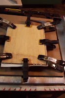
I try to glue up multiple panels of the same size so I can apply pressure to them all at once. I put the two or more panels together, so the canvas sides are together. Basically, the two glued panels are placed face to face, and pressure is applied either with a weight or using spring clamps as shown. This way the pressure is on the back and will not dent the canvas. I have also placed the panel face down on a clean flat surface and set a heavy object on the back. Let them sit overnight till the glue is dry.


Above you can see the glued up oval panels cut for the small oval frame.
Trim The Canvas
After the glue is dry I use a blade and trim the canvas flush to the panel. I try to slowly and carefully pull the blade down the side. I cut so I can see the how close I am to the panel, and do so front to back so the force of the blade pushes the canvas against the ply. Do your best to not disembowel yourself. Blood and innards will stain the canvas.
Now you have a nice trimmed panel for your frame.
See how nice it fits. Shown in a small, unfinished Castner frame.
 Now you just have to paint something on that panel that will amaze all of your friends. 
An extra tip, when painting on a small panel I highly recommend that you use a pencil and trace the inside edge of the frame on the panel. Remember there is often a 1/4 " lip on the frame. If you are painting a 3 x 5 panel that is a substantial portion of the picture. So make sure you are designing inside the frame, and not to the edge of the panel that will be covered by the frame. I have had few tantrums after realizing that some beautiful passage that I painted on the edge of a painting is obscured by the frame.

I am planning on doing a workshop on Frame Finishing for Artists. It will be sometime in the fall at the Castner Warehouse. Let me know if you are interested. I will post more details at a later date.  

One added note to this post- beware of the shipping costs if you order this product! I ended up paying almost as much in shipping as I did for the glue. I let out a blood curdling scream when I saw that.
Just a warning.

Saturday, August 7, 2010

Cincinnati Art Galleries- Then and Now

I was recently selected to be in a still life show at Cincinnati Art Galleries. It's a very prestigious gallery that generally exhibits the work of  Cincinnati's historic masters, along with the occasional contemporary painters work.
As you can imagine it was an honor just to be selected, but then my work was chosen to represent the shows 'new work' on the postcard.
Technically the Then and Now means Dead Guys and Dying Guys. As I have mentioned in the past I relate more to the dead guys, so that is very exciting for me. I just respect the dead painters so much more and hope to be just like them in 50 or 60 years.
The other painting shown on the card is by William Mason Brown and was painted in 1883. I am pretty sure he is no longer with us.
I will have roughly 5 paintings in the show. Hope you can make it down to see all the work.

Poetry of the Still Life; Now and Then
Opening Friday August 27th, 5:00 to 8:00

Exhibition continues through September 24th

Thursday, August 5, 2010

You can paint your cake and eat it too.

In the last post I commented that I have a tough time finishing a painting in one session. I was pretty much talking about still life, or any painting that needs refinement. Now I have painted landscape studies that I felt were finished in a 3 hours session, but even that is rare. I suppose I like a bit more finish, and for me that takes repeated visits to a picture.
Coincidentally, the day after that post I think I did an OK job knocking one out in a single session. It is a painting that I wanted to finish quickly. So, after a bit of time arranging the scene, and a quick sketch, I painted as fast as I could trying to get the canvas covered in 30 minutes. I probably covered the canvas with paint in about 40 minutes and then just tweaked the shapes, adjusted the value and color until I was happy. The whole painting was finished in about 4 hours.
 Cake and Cookies, 12" x 9", oil on canvas, 2010
I wanted to do a painting of some baked goods. I thought cake would be fun to paint. I stopped at Graeters Ice Cream shop to buy a slice of cake and a few cookies. It was very hot out and I don't have AC in my van, so on the trip to my studio with these edible still life objects, the cake suffered some damage. It was a bit smashed on one side and the heat caused the top half to slide off the bottom a bit . I had to do some artful reconstruction of the cake to make it paintable. The side had to shaved a bit to clean it up and some of the icing sculpted back into shape. This was a delicious bit of work. I had a variety of cookies. There was a lot of yellow in the picture, so I left out- and ate- the yellow iced cookie. The pink one complimented the cake icing well.
Just so you know that I am not the wasteful sort, all the food in the picture was consumed (except the milk- it had been setting out in my hot studio for 4 hours).

This painting will be available in a charity auction. You will be able to bid on this painting and all the proceeds will go to the charity. The event is actually a bake sale, and as I don't really bake (Unless making toast counts as baking) I decided to paint some bake goods. The charity is for Nick, the son of a good friend of mine.
Here is some information about the event if you would like to help out.
A Benefit Cake & Pie Auction on behalf of "Nick Finn"

Pattision Elementary School, 5330 South Milford Road, Milford Ohio


Nick is a 9 year old little boy who attends Pattison Elementary School. Nick has been battling a long term illness called "Pineal Germinoma" which is a tumor that greatly affects a gland in the middle of his brain. Nick's quality of life has been greatly compromised for the past three years as his medical needs has changed dramatically. 
Currently, Nick receives rounds of chemo at Children's Hospital and has platelet and/or blood transfusions as needed. Our goal for the auction is to take care of any special needs/wants for Nick, offset the Finn families financial needs ~due to loss of work and excessive medical bills.
Please let us know if you can either donate a cake, pie or any other special treat and we are also collecting: * gift cards, or gift filled baskets for a raffle by August 9th to one of the chair people.
There is a Facebook event page where you can find more info and contact someone if you have any questions like, "Please tell me how I can buy that wonderful painting of a cake?"