Advice on Painting from F. W. B. (Frank W. Benson) taken
after criticism by his daughter Eleanor Bedford (Scanned from an
original)
Thanks to Mary Minifie and Paul Ingbretson for
assembling and formatting the following text. I corrected some typos,
laid it out and added the images collected from the web.
THE CHALLENGE
"The
only fun in life is trying hard to do something you can't quite
accomplish. There is no real fun in accomplishing some definite fixed
thing.
"It is not easy. It is never easy. There is no
magic about it. It is just as much a science as the science of a doctor.
It has to be studied and worked at, and even then you never really
learn it. No one has any magic way of doing It. No one has anything to
start with except an over-mastering desire to do it, and the more you
have the desire, the more you will work at it and the more you will
learn. I am still working at it and learning, and that is all I care
about. I don't care about the pictures I have painted. I may become fond
of one and say "that's a good one", but all I really care about is
working at this thing, and it is still so far ahead of me that I shall
never reach it, and have only just begun to know anything about it.
SELF EDUCATION
"There
is no such thing as teaching a person anything. You may be helped
toward learning by a hint someone has given you, but anything you really
learn has got to be learned by experience and only by working and
solving the problem your self can anything become a part of your real
knowledge. Most people don't believe this, and want you to show them.
Showing them is like giving candy to a child. It doesn't help them at
all. They couldn't do it themselves and the next time they met the
problem they would not even recognize it. Most people think painting is a
God-given talent. It Isn't. It is a product of hard work and intense
mental effort and only those can succeed who have the capacity for work
and the necessary intelligence. (Said long before.)
“When
I was working in the studio in Paris the French Maitre who previously
had never been known to say anything to a student more complimentary
than "Pas mal", and that very seldom, said to me one day: "Vous avez le
metier dans le main; si vous jugerez mieux le caractere personelle de
votre models, vous deviendrez tres fort." There it is — Le metier dans
la main — your career is in your hand, to work out for yourself. No one
else can help you. But people will not believe this.
There
was dead silence in the room. It caused so much excitement that there
were crowds of students around my drawing all the rest of the morning."
(This was in the studio of M. Gustave Boulanger. The picture referred to
was the study of the head of an old bearded man. This picture was given
to Emerson Benson, cousin of F. W. B., and later Inherited by E. B. L.
and later given to her son, Ralph Lawson).
Me: "Thanks for the lecture"
FWB.: "All right. It won't do you a bit of good. You've got go dig these things out for yourself."
"The
only way to learn to paint is to paint, No matter how dissatisfied you
are with what you have done, you learn something. No one can tell you
things which you must learn from experience."
"My
belief lies in this direction—that you should learn absolutely to see
the thing truly as it exists, and then use that knowledge as you like. A
man should use his knowledge of this and express himself according to
his inclination, but beneath everything should be the solid foundation
of reality.
LIGHT AND SHADE
"The
important thing in painting is to keep everything as flat as possible.
Your tendency is to model surfaces too much, because you are looking for
effects of light and shade. Especially keep flat the less important
parts of a picture. Don't blend and soften too much. Where an edge cuts
sharply, make it sharp, with a flat value against the contrasting
background."
"You can't paint reality by just describing things. You must pay attention to light and shade and values.
"Look
continuously at the whole picture, not at parts, and roam from place to
place making adjustments. That's what painting is — Making adjustments.
Don't look at one part too long or you will paint it too much in
detail. The unimportant parts of a picture should not be minutely
described so that they will attract notice. Do the values and let it go.
Everyon - all of us — tries to get an effect by carefully describing an
object. That's not the way it's done. Go back again and again — I can't
say it often enough — to the effect of things when you are looking at
the whole picture. Anything is important which increases the effect of
light and shade. That light streak on the tablecloth for instance
emphasizes the shadow which the instrument casts across the table.
"Always
keep in mind the direction from which the light is coming, and the fact
that objects are casting their shadows across the table, even if barely
perceptible. That will help you to select the things that are of
significance.
"You are still thinking of things in terms of objects rather than in terms of areas of light."
"If you find a thing is going badly, go back and make more strongly the effects of light and shadow.
(Still-life)."Describe
the lights and shadows of the drapery in masses. Pay special attention
to the direction of folds in relation to the design. Invent if
necessary. Draw carefully and don't make fuzzy places. Where the edge of
the table disappears into shadow, don't make it plain. The light on the
edge of the table is important because it describes the kind of
material that covers the table. Yours might be a blanket."
Me: "Why do my watercolors lack a certain spontaneity and directness."
F.W.B.:
Because you don't look at things with their large aspects of light and
shade. As a design, not as objects. If you do this, you will get the
objects afterwards. No one who was not born with the ability to do this
can achieve it without a constant effort of will. If a landscape is not
worth painting purely as a design in light and shade it is not work
painting at all, unless by the addition of a wave or a rock or an
interesting form of some sort. Those pretty colors mean nothing without
good drawing and an interesting design.
"I simply
follow the light, where it comes from, where it goes to. In the
beginning make an artificially simple division of light and shade. Of
course, light has very subtle variations - it wouldn't be interesting If
it hadn't - but do not make them in the beginning. Get the large forms
right by the simple light and simple shadows. Don't fuzz It up and
soften the edges and lose the characteristic forms of ???, etc. In the
clothes you aren't sure just what you see in the large forms, so you
say, well, here is a wrinkle, anyway, I know where that is, and you put
it in and spoil all the large effect of the mass of light as
distinguished from the mass of shadow. You haven't made the shadows on
the white collar a part of the whole shadow, you are too anxious to keep
it looking white."
"You must be entirely absorbed by
the light and shade. You must turn right away from what has been most
important up to now - drawing -and put down merely what the eye can see.
Look for the places where the outline is lost and paint those most
carefully. Because that is very difficult to do, don't yield to the
temptation to draw a line around things. That (Mother's silver pitcher -
this was at 14 Chestnut) is very beautiful, lovely to paint. But it is
beautiful because wherever you put it, - there are places you can't see,
that lose themselves against the background. In arranging a still-life
you are carried away by the beauty of the things themselves, instead of
arranging them so that light is beautiful. Don't paint anything but the
effect of light. DON'T PAINT THINGS."
"You still won't
believe me when I tell you that the light on the whole figure is far
more important than anything else you can do (any details) In giving the
reality of the thing."
(Landscape). "Look at the
shapes of the lights and shadows, put them down flat, make them exactly
the shapes they are, without detail, and leave them. Don't puddle around
with leaves and branches. Make the shadows right in relation to each
other- near in value - and only when you have that done right, put in
details. As much or as little a3 you like. That is not important.
(About
a still-life with a vase of oak leaves). "I see very clearly the
simplicity of the way the light falls, and yet the drawing is terribly
complicated. As long as you try to make it better by improving the
imitation of things, you will get into trouble; paint the light only.
The drawing of the drapery gives the texture.
DESIGN
"There
never was a great portrait which was not great because of its design,
its arrangement or the whole figure and canvas, rather than just the
face. The face is important too, but much less so than the whole. Few
understand this, and because there is a face, think that is why they
like a portrait. ----- paints only the face and so will never be
successful in making a good portrait—paints the mask only and disregards
the design. No one can be told what design means, but must feel the
need of it and learn through experience. I never realized its importance
until I was In my 30's— had an intuitive feeling for it before. When I
realized it I enthusiastically organized a class in design at the
school and tried to teach the students something that I never had had
taught to me. They didn’t know what I was talking about.
"A
picture is merely an experiment in design. If the design is pleasing
the picture is good, no matter whether composed of objects,still life,
figures or birds. Few appreciate that what makes them admire a picture
is the design made by the painter.
"The important part
of a still-life is the design. Just so long as you are working on it to
improve the design the picture is going ahead."
(Apropos
of some photographs of places, I asked why it is that things dim; seen,
in a mist for instance, seem much handsomer than those seen in detail.)
"Simply because it allows you to see the design and does not distract
your attention with unimportant small things."
"You
will always get into trouble unless you design all the time you are
painting. Stop designing and you are in trouble. You are so fascinated
with painting, with making the things to look like reality that you
forget to design. The things themselves should be made only at the very
end —till then concentrate only on the values, and relations of color
and space.
"You should look at a landscape — here's a
way to get yourself into the right frame of mind — as if you were going
to decorate a plate, to make a pattern that would successfully decorate
that plate, and use the landscape before you to do it."
(I
said I did not like the way my paint looked when it was on) "That has
nothing whatever to do with it. Any more than what kind of ink I use in
etching. The only way to achieve the kind of effect you are trying for
is to get the right point of view toward the whole thing. Then you could
put on paint with your finger and do better than you do now. You will
never get what you are after until you arrive at the purpose that is
behind it. You have a certain sense of design, but you don't use it when
you sit down before a landscape. You try to paint what you have seen
other people do and to make it look like rocks and trees instead of
Using it as a design. The great value of simplification in design is
something you don't yet understand.
"Design makes the
picture. Good painting can never save the picture if the composition is
bad. Good painting - representation of objects -is utterly useless
unless there is a good design. That is the whole object of painting, and
unless you can think in those terms, you will never be a good painter.
That is why painting is bad for you, except as practice in
representation. You will not learn to be a good painter by doing
portraits. You are too much interested in an eye or a nose, in the
likeness.
"People who write about painting rarely know
what a painter is trying to do. It doesn't matter whether you use
landscapes, or birds, or people. Try to fill your space with the best
possible pattern. Only intuition will tell you what is right. Men have
tried to do it by mathematics. The Greeks had a feeling for it like no
other people since.
"A
picture is good or bad only as its composition is good or bad. You
can't make a good still-life simply by grouping a lot of objects,
handsome in themselves. You must make a handsome arrangement, no matter
what the objects are. Remember the clipping of a still-life of a
disorderly table desk with papers, a hat, etc."
(We
were talking of how the same principles of composition seemed to apply
in all the arts, and FWB told me of a conversation with his friend
Charles Martin Loeffler, the composer.) "We were sitting in front of the
fire and talking of pictures, which he enjoyed and appreciated very
much. Loeffler asked me to describe to him what went on in my mind when I
was In the process of composing a picture. I tried to tell him as best I
could, and went on talking I suppose for half an hour. At the end of
that time I said: "I don't know why I am going on like this, for it
can't mean much to you." He leaned forward and put his hand on my knee
and said, "My dear Frank, I am greatly moved by what you have told me.
3y changing a few nouns, that might be a description of exactly what
gees on in my mind when I am composing a symphony or an opera."
This
was to emphasize, again, the fact that it is the composition, the
design, the creation of the artist's mine, which is important, not the
representation of objects with paint. "I grew up with a generation of
art students who believed that it wa3 actually immoral to depart in any
way from nature when you were painting. It was not till after I was
thirty and had been working seriously for more than ten years that it
came to me, the idea that the design was what mattered. It seemed like
an inspiration from heaven. I gave up the stupid canvas I was working on
and sent the model home. Some men never discover this. And it is to
this that I lay the fact of such success as I have had. For people in
general have a sense of beauty, and know when things are right. They
don't know that they have but they recognize great painting. And design
is the ONLY thing that matters."
THE WHOLE
"Paint
in a tentative way - not as though you had to paint a picture of the
fabric to sell it to someone. The reason for the effectiveness of such a
way of painting is that you are painting a light, a value, in relation
to the whole picture - not just by looking at that exact spot and
painting what you see, which is what you do. That fold Is not
interesting in itself. But it is interesting to paint because of what it
does to the whole picture. You are still interested in too small things
- an ear, an eye, a likeness, that Is the worst thing, a likeness. It
takes your,, attention from the whole picture. But you have to have it,
of course.
"Paint a shadow where it comes, don't fuzz
it up. Then when it is dry, if necessary do the small things. Did it
ever occur to you that you could make things look lighter, not by using
more light paint, but by making a sharper edge where the shadow comes?
Paint exact shapes." (He takes mixed paint on the brush, held loosely by
the end, and drags it over an area that needs light or dark, leaving
irregular edges, slowly and carefully - modifies it, if necessary by
another brushful of darker color dragged over it. As different as
possible from mixing a lot of the same' color and slapping it on.
"Tentative." And the effect is miraculous. More like nature than the
most meticulously painted area. And glowing with light and color. He
says it is because he is putting down values in relation to the whole
picture. That does not explain it. To me.)
"Look at the picture as a whole all the time you are painting it.
"Look
at a head (or a landscape) always as a whole, as a head and not as a
collection of features. If you look at one feature alone you will not
make it in proper relation to the whole. Don't draw lines around
things—make them by rendering the light and shadow.
(About
a still-life.) "It is perfectly possible, with all those handsome
things to paint to go on making each thing better and better and at the
same time to have the picture grow worse and worse. The reason it looked
well at the beginning was because in order to get the thing laid out
quickly you had to make everything flat and simple. Don't paint each
object for itself, separately, but as a part of the whole. Paint the
Biosphere, in which all the objects are, and in which they have their
relations to each other. Don't fuzz things up, and mess the paint
around. If it isn't right, pushing it around and blending it in won't
make it so. Scrape it off and put in something that is right, drawing
the shapes carefully. But at all times observe minutely the delicate
variations of value between one thing and another or between the light
and shadow. Do not paint the figure, the rabbit, the Instrument — paint
the light and shade and interrelating values of the whole thing."
"A
picture is always a synthesis, never forget that. Made up, it is true,
of analysis—it must be. But the synthesis is what is important. Choice
is what matters. It may not be conscious choice, but what seems natural
and inevitable to the painter. This makes a distinguished sketch, or
picture. Distinction cannot be achieved by "spelling words" — by doing
each half-inch meticulously and perfectly. Never do anything without
regard to expressing the whole, the spirit. Your drawing must be better
than pretty good. It must be distinctively done.
"Do
not look at one spot and paint that exactly. Look at the whole thing.
Look at the head, and see at the same time what value and color the
landscape is, and upright of the screen.
"Paint in a
tentative way - not as though you had to paint a picture of the fabric
to sell it to someone. The reason for the effectiveness of such a way of
painting is that you are painting a light, a value, in relation to the
whole picture - not just by looking at that exact spot and painting what
you see, which is what you do. That fold Is not interesting in itself.
But it is interesting to paint because of what it does to the whole
picture. You are still interested in too small things - an ear, an eye, a
likeness, that Is the worst thing, a likeness. It takes your,,
attention from the whole picture. But you have to have it, of course.
"Paint
a shadow where it comes, don't fuzz it up. Then when it is dry, if
necessary do the small things. Did it ever occur to you that you could
make things look lighter, not by using more light paint, but by making a
sharper edge where the shadow comes? Paint exact shapes." (He takes
mixed paint on the brush, held loosely by the end, and drags it over an
area that needs light or dark, leaving irregular edges, slowly and
carefully - modifies it, if necessary by another brushful of darker
color dragged over it. As different as possible from mixing a lot of the
same' color and slapping it on. "Tentative." And the effect is
miraculous. More like nature than the most meticulously painted area.
And glowing with light and color. He says it is because he is putting
down values in relation to the whole picture. That does not explain it.
To me.)
AND RELATIONSHIPS
“Look
at the whole scene constantly. You are too anxious to complete the
thing instead of trying to see it right. You have got to give up what is
easy and attractive (and natural, too) to do, and simply try to see the
relations of values. A skilful man will seem to be making things at the
same time, but really if he is good he will be only painting "the
relations of things. You think you do, but you have got to do it
entirely differently if you are to get a real effect. Careful drawing of
shapes is not making things.
BIG LOOK
"You
are always making things too complicated. Looking for small variations
and little reflected lights. The trouble with most women is that they
soften and prettify things and so lose punch. Don't make it look right
near to — make it look right twenty feet away. Keep a flat tone over all
that background, edge on to the light, with a solid figure in front of
it.
VALUES
"You are paying too
much attention to getting different colors in the background. Colors
don't matter much--values are what you must get right—they are the only
things that give any effect of sun and shadow. Don't mess around with
your color and pat it down and smooth it out. Put it on and leave it.
And make it "strong." You can't exaggerate too much—in the house it will
all tone down and look too feeble. If a thing looks pinkish to you,
make it vermilion. Don't be afraid of making things too strong. Draw
very carefully the fine shape of a handsome tree or object. Take plenty
of time and draw it well. Not easy to do.
(Concerning a
portrait). "Don't draw the hair with strokes of the brush or make
ringlets. Make a flat mass of the correct value, and lay on the lights
drawing carefully the exact shapes. The light on that black hair must be
cool. And don't paint it with black paint even if it is black. Against
that green background It must have a certain warmth. (The model was not
present) ."The things that are important are the correct relations of
one thing to another—the hair, the shadow, the reflection, the
half-tones, etc. Until you have these values right it is absolutely no
use going ahead with anything else.
(Sketch of Mother
on the piazza). “Composition, Drawing, Values, Color, Hot local color,
Edges. Above all, values. How the light falls. Keep comparing everything
else with the darkest spot. With the lightest. Draw shapes carefully
-that is not finishing. Don't paint objects. Paint only values.
"When
you don't know what the values are, you make It fuzzy, try to fix
something that's wrong by doing something more wrong. If you can't make
sharp edges between the values, they are wrong ... By making a sharp
edge between the light and shadow, here, the shadow does not need to be
too dark.
"Scumble it with white or black if a thing goes wrong and start over.
LOST AND FOUND
"
I am going to talk to you about something I have told you many times,
and you don't know anything about. You over-represent things. You should
be looking for the places in the picture where you can't quite see
things, and paint those the way they are. Choose a subject with those
places in it. Look at that face and then at the shoulder. Compared to
the head you can hardly see it. You make it that way and the head will
suddenly stand out. In your effort to get the features and likeness, you
make everything alike, and immediately everything loses its force. I
don't mean things are absolutely vague, but relatively vague. Try it. No
one can understand it 'till it happens to them.
"If
that head wasn't there, you'd have a darned hard time telling what that
coat was. Well, make your coat just as hard to see. This is something
people never get told in school. It shows in all your work, landscapes
and everything.
COLOR
"When we
speak of color, we do not mean colors, such as the green of leaves or
the pick of cheeks. We mean the effect of light on an object, and the
effect which one color has on another nearby. No relation to what the
ordinary person calls color.
(Still Life.) "You don't
keep your lights flat enough. That is flat yellow light right up to the
edge, not fading away pinkly at the bottom. And you will not get an
effect of light unless there is more warmth In your shadows. I don't
know whether I see the colors — I think I do — or merely have learned
that things must be that color in order to have the necessary effect. I
sometimes think I have no sense of color, as people mean it.
"When
most people talk of color, they mean colors. What I mean is not the
local color of any object but the relative value of light and shade.
Warmth in the shadows. It doesn't matter whether a model has a colorless
face — there is color in the contrasts of light and shade. Don't make
your shadows so slatey. When painting the drapery don't make it in
carefully modeled stripes. (Drapery at the top of the picture). Look at
the center of the arrangement and then notice how much of the folds you
see-practically nothing, just a vague light here and there. Paint it so.
"What
gives charm to a picture is not the brilliant color—the strong
contrasts, but the delicate bits, where one thing comes against another
with no difference in value, and only a slight one in color. This is
what is hard to do, and hard to see. Only a trained eye can see it. But
the doing well of these bits is the most essential part of making an
interesting picture. What makes the difference between a good picture
and one where only the obvious differences are put down is how these
delicate, intimate details are made." (This is as near as I can
remember, and frequently repeated.)
WARM AND COOL
"The
difference between warmth and coolness gives the true colors. See in
the shadow there, behind the figure (still-life) there are lots of rich
colors. But look away from it and you will see that it is all very vague
compared to the figure itself. But vagueness does not mean fussiness,
it means a very narrow difference between the different values. Paint it
crisply, but keep it well in the background.
"Put down
things strongly that indicate the nature and character of an object.
Look for the significant things. Don't paint and model each little
detail, (of the drapery) but put down in proper value and warmth or
coolness of color the salient and characteristic lines.
"When
you notice that one color is cooler or grayer beside a warm shade it
does no harm to intensify the color of that spot as you do with effects
of sunlight.
NEUTRALS
"A real
artist is constantly looking for, searching out, the places in a picture
which are not brilliantly colored. The neutral colors—Tarbell calls
them the dirty colors. Without them, the rest lose their effect. A
picture all bright colors loses the effect it would have if there were
in it these contrasting bits of dull color. They are not noticeable in
the picture, but they are what makes for Its effectiveness—something
that people not painters think is made in some magical way.
DRAWING
"Drawing is only learned by long hard practice. You can't learn it quickly, and you won't learn it quickly."
"Drawing can be learned — a sense of color must be born in a person").
"You
are beginning at the wrong end; no one should begin to paint until he
is able to draw well. Drawing is always hard. You always have to work at
it, even after forty years(said in a discussion of Jacobleff's work).
“Get
rid of all that purple molasses. You draw things light-heartedly and
slap on paint. It would take anyone two hours to draw that branch
properly.
FLATNESS
"Lay the values in flat.
"You
haven't painted long enough to know what "flatness" means. It Is the
most valuable quality there is. You see a mere breath of difference in
value, and you put In all sorts of changes and modulations."
''You
don't know what flatness means. When that is dry, scratch on a few
lines of paint over it to make that place lighter. Get It flat.
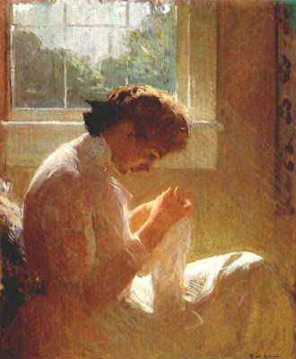 EDGES
"The
most important parts of a picture are where edges meet, or one thing
comes against another. Anybody can paint the rest of it. Edges must be
very carefully studied. If there is no defined edge, don't make one”
Don’t make edges meet. Paint one over the other. A sky with variations
of light and dark and especially a light or a dark line around the edge
of objects simply spoils all effect of reality.
"Don't
make a thing inconspicuous by making it fuzzy." (difficulties with the
background). "Make it flat in tone, all over, and it will stay back.
Never make fuzzy edges, unless it actually is fuzzy, like the back of
the hair." (portrait)
DETAILS
(About
outdoor painting.) "Don't fuss around with all the details until you
have your masses in and your composition arranged. The important things
are the edges. The contrast between the hard sharp outline of branches
against sky with the soft edges of shrubbery and foliage.
"If
you make things right in the order of their importance you will never
get into trouble. This business of fussing around with the details
before you have gotten the masses in correctly is what makes for a poor
picture.
"Do not make the unimportant parts of the
picture in detail, only do as much as you can see when you are looking
at the main theme of your picture. Don't make so many different values
and colors. Decide on what you want. Mix It. Try it. Mix it again if it
is wrong. Then put it on flat and leave it. If you can only do a small
part of the canvas, do It right and leave It that way."
"The
reason you got into a mess with that picture is that you get fascinated
with details and forget the main things. You had to have because you
had gotten into a state that you couldn't have gotten out of alone. Now
you have gone ahead in the right way." (The help consisted mostly in
blotting out and blurring what I had done, leaving the plan and the
drawing but obliterating the details, giving me a chance to start fresh
and repaint the lower part of the canvas.)
THE MAJORS
People
who paint cheap things do it by modeling the pieces. People who paint
good things seem to do it without modeling. If you put on a pure value
there, right up to the edge of the shadow, it will seem to model. Don't
paint square inches, paint large masses.
TIGHT V. LOOSE
"We
used to talk about "loose" and "tight" methods of painting
when we were
young. There are only a few people - Lucas Van Leaden,
Holbien, for
instance - who can paint as tight as a drum and still have
it good; and
that is because they look at it in the same way I am teaching you. And
they are able to paint in that manner and still not lose
the effect."
(In
answer to my question as to the explanation of the effectiveness of
"loose" painting.) "Because it admits the varying qualities of the
unseen. Literal description inpainting will never make a picture. In
order to be good it must have some touch of that magic which gives the
effect of light and shade, leaving undescribed the places that are dim
and cloudy, and painting sharply the silhouetted values."
PRACTICE
''Do
carefully and well what you do. If you haven't time to finish a sketch,
make what you do count. Don't hastily rub it in just to cover the
canvas and say to yourself you will go back and do it better
later—that's lazy, and besides it never looks the same.
LAY-IN
"A
head which is to look right when finished, in the early stages of
blocking in the lights and darks, ought not to look right; it ought to
look raw, crude, almost violent. Then all the qualifying tones will not
spoil its strong effect of light and shade when it is finished.
WET INTO WET
"Never
leave white spaces around the edges of things. That absolutely ruins
any effect of reality whatever. Beginners always make that mistake.
Don't paint two things up to each other, paint one on top of the other.
Sargent always said to paint the background of a head half an inch
inside the outline of the head, and then paint the head on top.
"Where
trees look thin, don't put a thin wash of color on over the sky. Decide
what the value is and they lay it on with plenty of paint.
PAINT QUALITY
Don't
paint with soup, paint with paint. You will never get any effect of
color without using lots of paint and very little medium.
"One
of the most interesting times in my painting life was when Tarbell and I
saw some pictures in Boston by a European artist— I've forgotten his
name — who evidently got his effects by using a very "full" brush. We
decided from that time on to use only a very full brush in all our work.
The effect is produced because you carry your color, or value all
across and it does*not thin out at the edges, but keeps it full effect
everywhere." (This still does not explain to me why this method of
dragging a full brush loosely across an area, leaving a more or less
broken surface of color, is so effective.I said it gave a certain effect
of texture, but he said no.)
PAINT HANDLING
"Sergeant
was said to "dash" his paint on to his canvas. It is good practice
(apropos of working from a model) to make a sketch by mixing your paints
carefully, studying your model carefully and then lay the paint on
where it should go and don't touch it again. Never puddle around and go
dab, dab, dab. Scrape it off if-it is wrong and lay on some more. But
don't pat it and blur it and try to remedy it by blending it with
something else.
STUDIO CONDITIONS
"Its no use trying to paint under unfavorable conditions. It’s hard enough to paint with everything just right.
STRENGTH AND DELICACY
(When
I said that my finished portrait looked "soft") "It is very difficult
to make the right adjustment between strength and delicacy. Both are
important and one must not be allowed to spoil the other.
ATMOSPHERE
"Colored
moving pictures do not attract me because although the local color is
there, the subtle variations of light and reflections are missing. Those
are what make any scene In nature attractive to the eye, although the
casual observes does not realize it. When one has analyzed it with the
eye of an artist and tried to paint these very subtle variations he
appreciates them, they are what makes the picture
good, what gives it an
atmosphere, and must be painted very delicately and with nice attention
to the minuteness of the differences. Although not at all obvious in
themselves, if well done they make the success of the picture.
STUDY
"There
is a saying that there is nothing more to be found in a picture by the
beholder than has been put into it by the painter. The more a painter
knows about his subject, the more he studies and understands it, the
more the true nature of it is perceived by whoever looks at it, even
though It is extremely subtle and not easy to see or understand. A
painter must search deeply into the aspects of a subject, must know and
understand it thoroughly before he can represent it well. The bald,
obvious aspect of a picture are not the interesting ones. That is why
the public will never understand painting. They admire it, yes, and like
it, but will never understand it because they cannot understand what
goes into the making of It. They ascribe all sorts of motives and ideas
to the painter—none of which he ever has—because they can't understand
how he thinks."
INSPIRATION
"Those
things which you do when you are freshly inspired and excited by the
beauty of what you are seeing before you are important things. If you go
back to them later and think you will improve them by making them
carefully, slicking them up, you will lose that important thing and
there is no method of getting it back. It is gone for good. Let things
look rough, rather than try and smooth them out. There Is a certain
inspiration which comes when you work quickly and surely and
enthusiastic about the beauty of the light. You should leave this work
and go back to it later to realize how good it is, and that it must not
be painted over. Get the force of the light.
AND POETRY
"A
picture or drawing is like a poem, when the poet starts, he has no more
and no different words to work with then you have. A work of art is
made by his choice — selection and combination of ordinary material.
Each man sees a subject differently and selects different things in it
to emphasize. See any roomful of student's drawings."
LANDSCAPE
( When I asked how to get the effect of a mass of bare tree branches against the sky)
"The
general mass effect is darker than the sky, even than the pieces of sky
seen through them. So don't draw a faint tracery of branches against
the light value of the sky—you'll get no effect that way. Put on a flat
tone just faintly darker than the sky and then indicate a few darker
lines against that.
SUBJECT
"The
trouble with you is that like most beginners you try to embrace too
wide a scene. You are looking for the sort of scenery that a
photographer would look for with lots of sky and distant hills. Be
broad-minded and don't go out with a pre-determined notion of what you
want to find to„ paint. Intimate studies of light and shadow in a small
area are most Interesting. A thing to be beautiful must be complicated.
Don't paint something bad just because it is simple. It's just like a
tailored suit—the thing must be subtle In order to be good. The fine
distinctions of value where one object comes against another are what
make a picture interesting. When Sergeant went up to visit Billy James
at Chicora, they went out painting and Bill led him along without saying
anything, and took him unobtrusively to the "town view", mountain
reflected in lake, etc. Asked him if he thought he could find anything
round there to paint. Sergeant said yes, he could find something
anywhere, looked around him and sat down and painted an old gnarled root
with, some leaves and branches on it. What interested him (and F. V.
3.) was the delicate play of light and shadows on the leaves and trunk.
"Whenever
I find myself—as I do sometimes—painting a "scene" I am disgusted with
myself. Take a small piece of something with a handsome shape—don't
include too much. That tree trunk against the cedars veiled "by the thin
underbrush in front. Don't take in the branches against the sky, that
gives a second center of interest."
"In looking for a
subject don't look for a grand panorama but a near thing with
interesting lines and values. DON'T PAINT A SCENE.
GOOD PICTURES
"A
good picture has a certain austerity, a distinction, whether of the
thing itself, the lighting, the color, or the arrangement. Mere
craftsmanship, representing nature, does not make a picture.
MODERNISTS
(Speaking
of modernists)" That is what the most honest of the modernists are
trying for. The plain fact does not interest them. They say "I will not
say D-O-G spells dog, because that is stupid and literal. So they make
something else, liberate themselves to say the same thing in another,
more interesting way. But the others, less honest, merely look at the
fact of liberation, do not understand what they were liberated for, and
merely think they can make anything and call it Art. They are not happy
about it, don't enjoy what they do, so says J.P.B (John Benson).
"The
modernists think they are Inventing something new every day. Men's
minds don't work that way. Every invention is based on completeness. You
might say I invented something. I merely noticed and painted an aspect
of nature that had escaped other men's observation. Now there are
hundreds of men who do the same thing, more or less well, according to
their real knowledge."


 Posts

