Showing posts with label Process. Show all posts

Wednesday, September 7, 2016

Ctrl Z, Ctrl Y

If you paint long enough, you are going to have stacks of paintings that are of no use to anyone. They need to be destroyed somehow. I suppose an option is to toss them in the garbage making sure no one gets their hands on them.
I decided I would do a total redo. Someone gave me a few old cans of oil priming white. Each can weighs a few pounds. It is dense stuff, and perfect for covering and making work go away.
So, what's under this painting?
Caffeine Bagged with Cream, 16X20, oil on textured canvas, © 2016 Richard J. Luschek II
The above painting is part of a series I started of coffee cups painted over old paintings with textured surfaces. I love what heavy texture does to the paint, forcing one to work almost like one would doing a pastel picture. It minimized details, which I like, as my tendency is to push paintings to a fine finish. I still do this, but the surface does force me to keep things broad and loose.
As the subject is of items destined for the trash, the surface seems to play into that mood for me by being rough and untidy. The goal for me is to always make a pleasing and beautiful arrangement of shapes and colors that uplift the 'common', causing us to stop and really look at a bag of stuff on the table in a way me may not do otherwise. I personally am more offended by a badly designed painting of a Ming Vase full of flowers than I am of a well design picture of garbage. I caught some flack on the social medias for belittling my heritage by painting trash. While I insist a painting be pleasing, the subject does not have to be. If that were true, war scenes, some historical events and many religious subjects would not be appropriate for representing.  I totally accept this picture is not for everyone, but I believe it is worth painting.

So, as I said before, what's under the cup painting?
A not so hot 2 hour figure painting I did in one session in my studio about 10 years ago. I did not want it, but the canvas was good.

Ctrl Z*- We will cover this up with oil priming white and fix everything.
Wow, much improved.
I palette knife it on and then brush it around till I like the texture I sometimes would push rags into the paint to get a texture and them smooth it out. 
A fresh white canvas. Doesn't this look inviting?
While the priming white is a fast drier, this stuff is on thick, so I let it set up for at least two weeks to dry before going on top with anything.

Ctrl Y- After two days I get it laid in.


So really, you are buying two paintings for one price. There is history to the canvas which was saved from the trash. The bag of cups has a history too- documenting my serious addiction to coffee.

You can see this painting and others from the series hanging at:
Rottinghaus Gallery.

1983 Madison Rd
Cincinnati, OH 45208
(513) 871-3662

*for those who may not get my hilarious, computer savvy joke, Ctrl Z, is the undo command on your computer. Ctrl Y is redo. If you don't already, start using them and improve your life.

Saturday, June 4, 2016

River of Blood- Sugary Blood!

Battle at the Red River, 16x20, oil on linen, © 2016 Richard J. Luschek II


The recent theme for my work is kids at play- and more specifically memories of my own childhood, so they are about a young Richard Luschek at play. The above painting is an attempt to move away from the emphasis on the word still in still-life and focus on adding more life. I decided I needed to step up the game in realism, not so much in execution and technique but thematically. My focus is still on design and the visual abstraction but the mood of the painting has to feel like a child at play.
I discussed the development of this idea in an earlier post based on the following set up. It felt stiff and not very real. It actually was separated into two different paintings.


This new direction resulted in my studio becoming a bit of a construction zone as I built some sets for my still life arrangements. I bought fake flooring and base molding, and made any props needed to give this a feel of being on the floor in the corner of the room.


After a week of arranging the stuff I felt the center of interest was weak. I needed a strong diagonal leading into the picture. The idea of using Red Pop just happened. I cut some red paper into a puddle shape to get a visual idea and it all started to fall into place.


This is a photo after my first day lay-in. I poured red pop on the table and painted it as quickly as I could as it would slowly run off the edge and out of the set up. I was spending too much time cleaning up red pop. I tried to level the floor but the pop would find a way to run away or just slowly evaporate.


I decided I needed a something that would give me the look of liquid but not move. I thought I could paint it on the floor, but color and transparency were an issue. I finally decided that I could use the recipe for fake blood: Corn syrup and food coloring. The recipe for red pop is not that different- it was just too wet. I mixed up my concoction and drizzled it in to place. I had to use a brush to mold and shape the puddle into shape. It eventually set up and I had my stationary puddle. The only issue was that it would get a skin on it over time and wrinkle. I would just brush water on it to flatten it out and reactivate the liquid appearance. 
I eventually had to scrape the corn syrup up and clean the area adding real red pop to the scene again to finish the painting. The spill was the most difficult area of the painting. I repainted it for a few days  till I was satisfied.

So this is the start of my new plan to blog more. If you follow this blog you know I have said that before, but this time I discovered there is this cool app on my phone that will remind me to post. Its called the calendar app, I highly recommend it.

Friday, January 22, 2016

Time To Put On A Show!

After some reflection, some depression, some self flagellation and a round of the typical New Years promises, I have decided that I need to step up my game. While I feel like I am improving as a painter, the subjects and compositions have gotten stale and safe.
In December I started setting up a still life but it just was not making me tingle. I had a discussion with my friend Joe Slucher. While looking at one of my struggling still life set ups, he mentioned that it seemed forced, "Did your mother let you play with your toys at the table?"


The rough idea was there, but it was obviously not working. His comment was like an creative wedgie for my brain. It got me thinking about the realism of the subject. I am painting these scenes of kids playing- really memories from my childhood. These scenes of the 'kid version of me' need to be more truthful. How do kids play? More specifically, how did I play, and how can I create good design out of that?
Kids play on the floor. Kids are messy, nasty creatures. If you have boys you can't have nice things.
I am still pretty immature like most artists I know, but I forgot what its like to play. What did 8 year old Richard play like? Oh, I know what you're thinking- "He played beautifully and brilliantly!"

Starting from scratch, I split this still life into two set ups. In order to do this, one of the issue I had was that the backdrop is not big enough and I'd like to have the option to work in a corner, which allows for various planes of value. Also, I needed an area where I could set up on the floor if needed. I had a small sheet of plywood on the walls that I could paint for back drops but it was not good enough. I had to go bigger.

So I built some walls in that spot. I thought about using drywall, but figured plywood would be more sturdy and could be moved to the other side of the room if I wanted.

I glued and screwed these flats and used joint compound on the seam. The side wall is just screwed so I can move it if I want. I added some old picture rail I found to the top and curtain rods on hooks so I can add fabric to any scene. I wanted a wood floor and found that you could buy sample boards of Pergo (fake wood flooring) for $5 a board. I added the base molding and had a faux corner of the room set up on which to assemble my scenes. One added feature I never thought of was that the back of the side wall now gave me a place to store my stretcher bars in an upright and organized fashion.


To the right I have another set up on top of my file cabinet that needed some work too. I decided to make a mini corner of the room even though this is a higher straight on view.
I built the small corner for the top a while ago and just needed to add base molding and a floor- all of which is loose and can be removed. The nice think is that later on I can repaint the walls a new color, paint the molding, change out the floor or even add carpet. 

I then was thinking it would be nice to have an outlet or light switch to add for more options.
I drilled out the rivets on an outlet and switch, then sanded them down till they were flat. I added some tape on the back to clean it up and I have flat set decorations.


They could be added to any scene. Here I even plugged an old cord- after cutting off the tines a bit.


I used some wax to stick the light switch to the wall in my other set up.
I am pretty excited about these new 'stages'. I look forward to working on the paintings for the next few weeks.
More about these paintings coming soon.


Tuesday, September 22, 2015

Art Store Demo Doughnut

Yeah, I even blog on my birthday. That is how devoted I am to shameless self promotion. Honestly, I have not been great about keeping up with the blog, but I am a year older, so lets see how things go blog wise this year.
I was asked a few months ago to do a demo in the local art store, Plaza Art Supplies. I like to demo, and while the painting that I do is generally not stellar, I do like to talk and discuss how and why I work the way I do. It was a fun experience and was attended by a great crowd of attentive and inquisitive art folk.


The still life was pretty simple- a few objects in front of white screen. I have said it many times in person, while teaching, on this blog and in my dreams that it is never a good idea to compose quickly and without thought. Showing up in a new location in front of crowd does not result in brilliant composition, but I thought I had some interesting things going on- like a glazed doughnut.  I did do some online research concerning the correct spelling of doughnut vs donut. Apparently both are acceptable, though donut is a more low brow spelling and also may result in free advertising of Dunkin Donuts- the McDonalds of doughnut shops.
I did pick up a Crispie Cream doughnut at the gas station on the way to the demo. It ended up being a nice "red" center of interest. Unfortunately I also go some terrible coffee to drink during the demo. Who would have thought gas station coffee would not be delicious.

Crappy 3 hour Demo Lay-In
This is the lay-in I had at the end of the 3 hour demo. Not my best. Again, I spent a lot of time trying to sound clever.
This canvas sat in my studio for a few weeks before I decided maybe I should try to finish this painting. I wanted to set it up in the studio, get a new doughnut and fix the composition. While I was using many of the same objects and table cloth, I was basically starting from scratch. Day two went better as I was not trying to be cute and clever to a crowd.
Here is the re-lay-in in the studio.
Day Two Lay-in in studio
Much better. The values were better due to the natural light and the design was a bit more interesting and clustered around a strong center.
After this first studio day I got busy with some other deadlines and was away for a bit. A week of studio heat and bugs necessitated me getting a new doughnut (Also just a good excuse to get doughnuts in general- I need doughnuts for Art!)


Day 3- Doughnut #3
I was not fond of how the table edge ended close to the lower left corner, so I painted the corner of the table in to keep the eye from running out of the picture. As you can see from the set up above, the corner was not actually in that spot, I just painted it where I wanted it. While I generally try to set up and paint exactly what I see, occasionally some 'artistic license' is needed.

Day 4
Day 4 my wife was complaining that the doughnut looked 'obscene'. Too many bites. I argued there was nothing obscene about biting doughnuts, but I did sort of get what she meant. I noticed that the two bites and the unbitten part were 3 equal, boring units. A weird series of equal sized shapes is never good in a painting. The doughnut also did not really have much of presence. Also, the sprinkle distribution was weak. It was a wimpy doughnut. The rest of the painting was coming into focus.
Time for More doughnuts!

Day 5- Doughnut # 4


Doughnut #4 from Graeter's was a winner. The icing was pink in areas and had a lot more sprinkles. I am hoping someone from Graeters sees this posts and gives me free stuff. The Doughnut was bigger and the color more exciting. I ignored the sprinkles at first trying to squint and paint the general look first.
I got to a point where I was not sure if I was done. I had my friend Carl Samson have a look and he smacked me around about there being too may sharp edges. He was very much on the money so I spent the day trying to get back to the 'big look', seeing the thing as a whole, rather than focusing in on ever edge, everywhere.
I also decided the view of doughnut was not quite right, as I wanted the doughnut hole to show more.
More doughnuts!
I bought a stand-in for the hole of the doughnut rather than changing it out. I just set it nearby and painted the hole of the new doughnut on the old one.


Below is the finished painting. The added bit of red and yellow to the center of the doughnut really helped. I tried to keep the sprinkles soft and not too strong. Only painting a few strongly towards the front.
I finished it fast enough this day to be able to eat the whole, hole stand-in doughnut.
This was an 8 day, 5 doughnut painting.

Doughnut and Coffee, 14x11, oil on linen, 2015

Wednesday, March 26, 2014

A Study in Orange

If you asked me to pick my least favorite color, of the primary-secondary groups, I would probably chose orange. Well, the idea started with an old Cincinnati Bengals hat I found in a box of stuff I got from my parents house. I used to wear this hat when I was in grade school. So as this developed the orange spread. I did like that there was a system of various oranges working throughout the setup. I spent a lot of time designing the placement of the Doritos. More than a few got removed and eaten.

Since I have done more than a few Cincinnati Reds paintings, I thought a still life with themes of some fans enjoying a winter game would be a fun change. While neither I nor my family were huge sports fans, I do have some good memories of the family sitting around in the house during a wicked winter watching the Freezer Bowl, the 1981 AFC Championship Game between the San Diego Chargers and the Cincinnati Bengals. One of the last really exciting seasons the Bengals have played in. I will probably call this painting The Freezer Bowl.

I wanted it to have a retro feel, so I collected items that pretty much fit that theme. Not sure how accurate all of the items are, but close enough for this painting. I thought a blue table cloth would be a good compliment to the all the oranges. The orange crush was found unopened in an antique store. The liquid had turned brown with floaters so I had to dump that out and add some new orange drink.

Set up with blank canvas.

My first day lay-in went pretty well.
Freezer Bowl, Day one lay-in.
After painting on this for a few days I decided that the background was a bit boring, so I added a screen next to the set up to cast a shadow. This helped in a few ways, but mainly it took emphasis off the football thus strengthening the center.
Freezer Bowl- about Day 4.
As I pushed towards the finish I realized the black of the hat was too strong so I forced it a bit lighter than it was in nature. It ended up making the hat look fuzzier. I softened a lot of the sharp edges and made sure the "visual punch" was in the center of the piece. I had hoped to finish the painting before the remaining Doritos got stale, but turns out that happens pretty quickly.
Freezer Bowl, 16 x 20, oil on linen, ©Richard Luschek 2014

Sunday, July 15, 2012

Totally Sconed

Off To The Races, 12"X 9", oil on linen, ©copyright Richard Luschek 2012

For my latest still life I decided to add a pastry to my typical coffee still life. I am not sure the percentage of still life paintings I have painted that include coffee but it is pretty high. It is probably pretty close to the same percentage of foods I consume- which is mostly coffee.
I was looking for some biscotti to add since I needed some 'yellow' to the picture but ended up getting a scone. I think this apricot, but I am not really sure. While it looked delicious, after a few days in the hot studio and evenings in the fridge I was not willing to eat it. Not sure about the title, I just chose that because the big nosed cartoon Italian on the coffee maker looks to be firing a gun to start a horse race.

3 hour lay-in, ©copyright Richard Luschek 2012


I am sure I have mentioned it on this blog before, but the lay-in is my favorite part of the painting process. Working fast to get  the "big" look is when I have the most fun. Even though I am making all the decisions that will result in a picture that will hopefully have the big impression, it almost seems like magic. While I enjoy the process from start to finish, everything after that first day feels like work.

Painting on the left, the still life set up is on the right.


Day 2, ©copyright Richard Luschek 2012


The second day, the picture is made to look more like nature, slowly coming into focus. I made up some coffee in cup. I had picked up some coffee to put in the cup, but I drank it all.


Day 3, ©copyright Richard Luschek 2012    


This time I managed to save some coffee to put in the cup. I was doing my best to finish the painting on the third day. I didn't, but I got it close.
On the forth day I decided I needed to improve the design, correct some of the values and make sure the wax paper looked a bit more transparent- which means I had to repaint it. I strengthened the light effect and worked some of the leading edges. I added some steam to get a bit of life into the painting.

Day 4- Off To The Races, 12"X 9", oil on linen, ©copyright Richard Luschek 2012

Thursday, June 28, 2012

From my tool box

Bolt, Nut, Washer and Wrench, 3.5" x 5", oil on linen, ©copyright Richard Luschek 2012

Finished this manly little still life today. I posted the lay-in the other day, and with a few hours more I got the picture finished up. As you can see from the lay-in shown below (probably about 3 hours work) I am trying to get the general look of the set up. I try to hit the general key and color- basically I work from the middle. What I mean by that is I am not usually indicating the darkest darks or lightest lights- just the general tonality. I work fast and loose on the first day pushing around shapes until I like the abstraction. I did a very rough drawing, with just enough info to make sure the image will fit on the canvas. I try to do as little drawing as possible, and them paint with big brushes so I can only paint broadly.
I let the painting dry and then start in on a second coat trying to get it more like nature. The image starts to come into focus. I never accept that the drawing is done, constantly moving things to improve the image. I use more oil at this point to get my darks to flow thinly. I either use a medium (1/3 stand oil, 1/3 damar and 1/3 turpentine) or poppy oil, which I have been enjoying lately. I paint with thick paint in the light areas. The highlights are placed in almost in piles and carved into shape with a small sable brush.

Bolt, Nut, Washer and Wrench (first day lay in), 3 1/2 x 5", Oil on linen, ©copyright Richard Luschek 2012

Thursday, January 12, 2012

Put Some Sugar On It!

I started two 5x7 paintings just before the New Year and thought I would post them after another paintin session. I made a few changes but mostly just pushed it to a finish.Of course this involves refining and bring it to focus, but all the while I am correcting not just drawing, but value and color. No matter how much I think I have it on day one, a fresh eye reveals more.
Cream and Sugar, Oil on Linen, Each 7"x 5", © copyright Richard Luschek 2011
So you can compare before and after, below are the paintings after a few hour lay- in.  I thought the right panel was boring, so I repeated the opened sweetener pack and added a spoon to the cup.

Cream and Sugar (Day 1), Oil on Linen, Each 7"x 5", © copyright Richard Luschek 2011

Thursday, November 24, 2011

A creepy new friend.


I have really been wanting a Mannequin.
I don't mean the 80's movie starring Kim Cattrall, though it was pretty awesome. Honestly I think I liked the sequel a bit more- but I digress.
I have been looking for a poseable manikin for the studio to use for doing portrait work or to set up if I need to do fabric studies. It is tough to get any model to pose for long periods of time, so it is useful to have something to dress in the costume.

The full-sized wood ones sold at art supply warehouses are pretty expensive and can run up close to $1000. I figured I could make my own or find something cheaper that I could make work. Even an old department store mannequin could be used somehow.
There is a local fellow that has a great suite of warehouses full of antiques. He has some great stuff and I am often dropping in to look for still life objects or for stuff I need to fix my 100 year old house. I called him and told him if he didn't already have something to be on the lookout. He just called and said he had found me a creepy dude. It is an old medical mannequin, and was not really in great shape, but the price was right.  I spent a day and an evening getting it fixed up. I built a new hip, made a wooden foot and fixing up some of the joints. The other nice perk is that I can practice my CPR technique.
I still need to fill the chest and stomach areas somehow, the light patches on the arms and legs are spots where you can practice giving the doll injections. They were missing in a few places so I sprayed expandable foam then trimmed it smooth.


The fancy new wooden foot I made out of a piece of 2x4

My next order of business it try to make it so I can set a pose. The joints are pretty loose so I can't lock a pose yet.

As it stands he is just a creepy fixture sitting in a chair in our basement. It freaks my wife out every time she goes into the basement.
I will probably be dressing this fellow up like a Knight Templar for a painting I am working on. Look for more photos of my new creepy friend in the future.

Friday, September 30, 2011

Post Season

I rarely pull of a good design or well thought out picture quickly. The set up of a scene or still life needs to be tinkered with for a while before anything good comes of it.
This spring I did my best to do a still life fast so it could be in the gallery window before opening day of the Cincinnati Reds baseball season.
I set this painting up in a day and finished the picture in a week. It was too big a picture to manage in that amount of time. I even adjusted the composition by adding stuff to it late in the week. First I added the curtain, then the hot dog was added in the last few days.
Revisit that post here.
I just got this painting back from a show at the University Club and seeing it with a fresh eye made me cringe a bit. It was probably not ready to hang in a show.
So, I have set the still life up again, the best I could, and am attempting to make this picture a successful one.

What are the issues with the painting?
Opening Day (1977), 18 x 24, Oil on Linen, ©copyright Richard Luschek 2011
-The main problem I had was that it lacked 'punch'. Basically, it had a weak light effect. Also, the colors seemed a bit boring and seen as local color rather than impressionistically.
-There are too many overly chromatic colors in the edges and not enough bright colors at the center.
-The picture felt out of balance. It looks too heavy on the left side. That space in the upper right was begging for attention, so much that it drew attention.

I actually have had a lot of fun diving back into this picture. I am being less precious about it. I am able to ignore whether or not I am being accurate and concentrating on the quality of the end result. Setting up a still life months later is pretty much impossible to match exactly. As the light and scene are a bit different, I can only take bits and pieces, using the still life as a suggestion.
I have begun to address all the issues I had with the painting and will discuss them more thoroughly when I finish.
Here is the updated image as of yesterday.
Opening Day (1977), 18 x 24, Oil on Linen, ©copyright Richard Luschek 2011
Other than the obvious stuff, like raising the top of the hat and adding the team photo, I have been softening edges to add some breadth to the picture while strengthening edges, chroma and values in the center.
The team photo is barely past a lay-in stage, so it will need a bit more work, though I will do my best to keep it loose so it does not draw too much attention.
I think it is much improved.

Wednesday, August 17, 2011

Framing Options

Last post I discussed my newest painting. I have been trying to do standard size paintings so I can easily get frames, but this time I strayed from that promise to myself and painted an arched painting for which a special frame was needed.
I thought I would post the process for making these special frames.You can follow along and make some yourself, though it would be best that you have some basic knowledge of woodworking and own a few tools. If you don't, I suggest you make friends with someone that does- Oh, and by the way. I don't mean me. I have enough friends and this blog post is as far as I am willing to go.

Basic idea here is to take a frame you already have, place a panel in the frame where the painting would normally go, then cut a new opening for a smaller picture. This can be done for any size or shape. This time we will be making an arched insert. I really enjoy the arched top paintings. It is a pleasant shape in which I enjoy composing.
If you have a lot of frames hanging around the studio this also opens up your options. Sometimes a frames is not quite the right size or shape. I have quite the collection of old frames and am adding to that pile all the time. Small paintings often feel better with a big frame on. So you can take a 6 x 8 painting, using one of these panels to add an inch all around, and now the painting and panel will fit an 8 x 10 frame (did that make sense?)

After showing the steps to make the insert I will show you how to apply a painted finish. One "do it yourself" frame finish I am almost always happy with is the flat black, hand rubbed finish. I will explain how that is done at the end of this demonstration.

Below is a frame I purchased for $20 at Castner Frames. It is for a 16 x 12 picture, the opening is 15 1/4 by 11 1/4. For my 13 x 9 painting with an arched top, this frame will work perfectly. I just need to make an insert. This is basically like making a fancy matte for a frame out of wood. While I am doing this for an arched top frame, it can be done for a square or oval picture.

Step one- Cut your insert:
I will start with a quote by Norm Abram, one of my heroes. "Before we use any power tools, let's take a moment to talk about shop safety. Be sure to read, understand, and follow all the safety rules that come with your power tools. Knowing how to use your power tools properly will greatly reduce the risk of personal injury. And remember this: there is no more important safety rule than to wear these — safety glasses." 

I have a 16 x 12" frame, so with the rabbit in the back I need and insert that will fit. Measure its exact size to be sure. For my insert I use a material called MDF (Medium Density Fiberboard). It is like a hard cardboard, made of paper fiber, wax and resin. It cuts like wood and takes paint well. You can buy handy 2' x4'  sheets at most hardware stores. For these panels I normally like to use 1/2" thick, but all I had was 3/4". Either thickness will work.
I cut a piece to fit tightly in the frame rabbet- make sure it is square (you can check the diagonals, corner to corner, making sure those measurements are equal). I used a table saw, but a jig saw will work. I penciled out the size and shape of the new opening on the panel, making sure to center it. I drilled holes in the corners big enough to accept the jig saw blade.


Step Two- Cut out opening:
I use my trusty Jig Saw to follow the line as closely as I can.

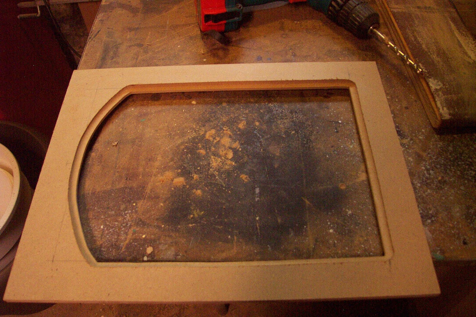
Step 3- Smooth the cuts:
Using wood files and sand paper (100 grit) I sand the cut edges smooth. This step is important, so spend the time to get this right. You want smooth edged and nice curve. The saw is not exacting and will need to be cleaned up. I have an orbital sander that helped  speed things up. Be careful to not sand at an angle or dig into the corners.
Step 4:- Route the edges:
You will of course need a router and a few bits. You need one bit for the  edge that meets the painting. I used a simple cove bit- shown below on the right. A rabbet bit is used to cut the space in the back of the panel for the painting to fit into. The 45 degree chamfer bit eases the outside edge of the back of the panel were it fits into the frame. This is not necessary, but since I had a larger 3/4 thick board it just looked better. Read all safety precautions when doing this step. MDF resins contain small amounts of Formaldehyde, so wear a mask with cutting and sanding.


If you do not have a router, you could probably file an edge on the front as a transition, and just use z clamps to attach the painting to the back without a rabbet. This will take some time to get your hand filed edge even, but it could be done.

Step 5- Chisel the corners:
The router bits are of course round, resulting in rounded corners. You can leave them, but I think it looks cheap. I use a straight edge to mark off squared edges and use carving chisels to cut them square. I first cut straight into the corner, with a straight blade. Next I carefully make slight cuts on the squared lines I drew. Use the rounded chisel to ease out the material from that corner until it looks like a smooth transition. Sanding is usually required to clean things up. Go slow, as it is easier to take off more than to add some back.


 Step 6- Suck it up and don't be a wuss.
Sorry for the graphic nature of the next image, but I want to demonstrate two things. One, that you need to be careful when using sharp chisels, always cutting away from your hand. Second, I wanted you to see what a total bad ass I am.
Did I stop here? No, I continued on like a man.

Yeah, Sorry about that Norm.

Step 7- Attach insert into frame:
You need to attach the MDF insert into the frame. I used pocket screws, being careful to not screw through the front of the frame. I have done this before. When this happens it is followed by about 15 minutes of profanity, and an extra 30 minutes of work repairing the frame. You can glue the insert in, use nails or just use z brackets as if you were putting a painting in the frame. I also fill the screw holes so it looks better. Not necessary unless you have OCD like I do. Finally, go over the frame, sand any sharp edges front and back, fill any holes and generally make sure the frame is ready for paint. I clean off any dust with a rag or tack cloth.
Step 8- Prime and paint:
I used Red Iron Oxide primer in a spray can to coat the frame. I suggest you do this step outside if you can. You will find any remaining imperfections after you prime it. You can fill and sand those and then prime it again. I usually paint the front and back making sure to cover all the edges. The MDF will suck up a lot of paint. Painting them will make the fibers swell on the edges a bit. Sanding and priming a few times will get them very smooth. After the primer dries (usually I wait 24 hours) I coat it with a fast drying ultra flat black. One trick I do, is to force the paint to crack. I like this look as it adds age and variety. If you want some cracked or wrinkled looked to the finish, Look for a can with  instructions suggesting you recoat it withing two hours or to wait 5 days. Paint will continue to cure even after it is dry to the touch. The paint is still uncured enough within two hours to accept a second coat. The paint will tighten and move as it cures for days. I disobey the directions and paint it after the suggested time. I wait about 4 hours and then spray it with a heavy coat, being careful to not get any runs. I paint heavier on the larger flat surfaces. This top coat which dries and shrinks faster than the under coat will start to crack in a few minutes. This is not an exact science, but it almost always works. I will say on this frame I got just a bit carried away. I prefer the cracking to be a bit more subtle.
 Here is the frame after a final coat. You can click for a close up view to see how the paint cracked.
 Step 9- Silver leafed edge and Final finishing :
I decided to add a silver leaf edge. There is a silver coffee pot in the painting so it will match. A leafed edge can help ease the transition from the frame to painting. I am not a leafing expert. This topic would require its own blog post. I suggest you look elsewhere for gold or silver leaf advice. If you want you can also paint the edge silver or gold. At times that looks almost as good.
I lightly sand the frame, especially the raised edges slightly to get through the black paint to the red primer. This gives it some age, distress and variety. The final step is to use butchers wax. Most hardware stores should carry the wax. Using a clean rag, I scoop up some wax, giving it a nice even coat. I then use Rotten stone, a gray powder used for polishing. I use that to dust the corners and draw around the edges with a brush that has been dipped in the power. Blow off the excess. After the wax as set up a bit, I take a clean soft cloth and buff the frame. It will get a very deep shinny finish. I leave the rotten stone in the corners. It will stick to the wax and give it an aged look that I like. You can see that powder stuck in the cracked paint as well.
 On the back I add the picture wire and the z clips for holding the painting.

Here it is all put together.
I really should stop making frames and just paint more pictures- but wasn't that fun?