While I do have work in a big show opening tomorrow at the
Eisele Gallery, I thought I would chat a bit more about the frame I made for the
Star Wars show, hanging until the end of the month at the
Brew House. If you and your children are Star Wars fans and you don't show up and buy them some art- someone really should call Child Protective Services on you.
 |
| Philosophical Sci-Fi Drive-By, Oil on linen, 20"x10", © copyright Richard Luschek 2017
|
It all started when I bought an old toy case in an auction. Also in that pile of toys was the AT-AT I used in the still life set up for the painting, the R2 cassette player in my
other painting, and a C3PO case. I already had a Darth Vader case from my childhood and this one was in bad shape, so I did not feel as bad appropriating it.
First I had to cut the case apart and trim off all the extra plastic. I had to cut into the bottom to make room for a panel and then made a paper template that I would be able to screw to plastic Vader head.
I traced this and added lower frame section on a sheet of 1/2 plywood that I found set out by the street for the garbage. I just wanted a rough shape that I could add the actual frame to.
There were holes in the case for pushing in plastic bands to hold in and lable your Star Wars action figures. I was able to screw into those and secure the panel to the head. Next I cut a square in the panel so I could start adding hardwood to the front.
Again, the hard wood is from a painted shelf I had in my scrap pile.
Now I just had to sand it all and start adding my decorations to it.
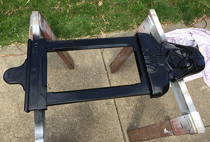
The frame looked a bit blocky, so I added some edging, and a finally to really take it over the top I cut a piece for Darth Vader's cod piece. Which, after studying Vader's costume, I realized has a door on it. I guess even Vader needs to use the rest room. Now Im thinking every frame should have a cod piece.
After looking up reference for Vader's belt, I cut the designs out of cardboard and wood. They were glued on and the entire frame was sanded smooth. It was ready for painting. I bought gloss black plastic spray paint. Luckily it was a nice day so I was able to spray outside. I wore a respirator as that paint is pretty noxious.
I had a slight issue when during the second coat, the paint on certain sections started to wrinkle. I had waited what I thought was the correct time between coats (48 hours), but it was a chilly week and had apparently not cured enough. After a temper tantrum, which is very embarrassing in hindsight, I let it dry in my hot van for a few days, sanded it all smooth and gave it a nice clean final coat.
I love that it has a medieval icon look. I have more old toys in my basement, so another Star Wars frame may be in my future.