Wednesday, August 24, 2011

Art Students- then and now.

The title of this blog post was going to be "OH MY GOD! WHAT THE HELL IS GOING ON WITH THE WORLD?! WE ALL DESERVE TO DIE IN SOME SORT OF TERRIBLE AND PAINFUL FIERY APOCALYPSE!  SINNERS! SINNERS!!!"

I thought that title may be overly dramatic, so I went with  "Art Students -Then and Now".
Why am I all worked up again, you are asking. Well, today it started with a post I saw on the site ArtDaily.org. This is a site which posts the terribly infuriating and sad news of the arts today. "Why torture myself by reading this" you ask? Well, it does occasionally have some sort of interesting bits of news about  museum shows, artists, archeological discoveries or art auctions. The rest of the stuff .........

I am not a fan of BS. If I were I would have gone into politics.
Truth is beautiful in life and in art. I respect art and artists that follow that model. The rest I dare say borders on being evil. Most contemporary art today is closer to vandalism than it is anything else.

Just to set the tone: In reading a book on one of my favorite artists, Jean-Baptiste Chardin, there were some quotes by him discussing the hard work involved in becoming a painter. He talked being a young student in dusty academies with backs bent over drawing boards copying from the antique and from nature. The years and years of hard work he put into his studies  before he was able to paint beautiful pictures. The genius of Chardin owes much to the training and study he received.
Below is a painting by Chardin of an eager art student working diligently.
Fast forward 300 years.
Here is a photo I found today on Art Daily of art students in training.
These are students of the Royal Academy of Visual Art in The Hague, The Netherlands. 

Let me repeat that... " THE ROYAL ACADEMY OF VISUAL ART!"
Below we see the eager students "diligently" participating in a "Graphic Design workshop".  
They are hard at work with an improvised drawing tool. To quote directly from ArtDaily.org - "Pencils, pens and brushes are stuck to a vibrator that makes drawings on the paper. At the start of the new school year students participate in all kinds of workshops."

I bet they do.
I don't really have to say much more do I? This is not drawing, this is not training, nor does this fit my definition of "Royal" or "Academy". It is a self important playground for a culture with too much free time and too little respect for beauty and truth.

The only thing that should be vibrating on the end of a pencil is an eager and intelligent art student with respect and love for the world around them.

Of course there are schools out there that offer training similar to that received by Chardin. They are not in Universities, Academies or Colleges, they are private training studios. Though they are rarely, if ever mention on Art Daily.org. If you want good training, find artist you like and go study with them. If they hand you a sex toy during a drawing class, ask for your money back and contact your lawyer.

I am still waiting for that fiery Apocalypse.

Wednesday, August 17, 2011

Framing Options

Last post I discussed my newest painting. I have been trying to do standard size paintings so I can easily get frames, but this time I strayed from that promise to myself and painted an arched painting for which a special frame was needed.
I thought I would post the process for making these special frames.You can follow along and make some yourself, though it would be best that you have some basic knowledge of woodworking and own a few tools. If you don't, I suggest you make friends with someone that does- Oh, and by the way. I don't mean me. I have enough friends and this blog post is as far as I am willing to go.

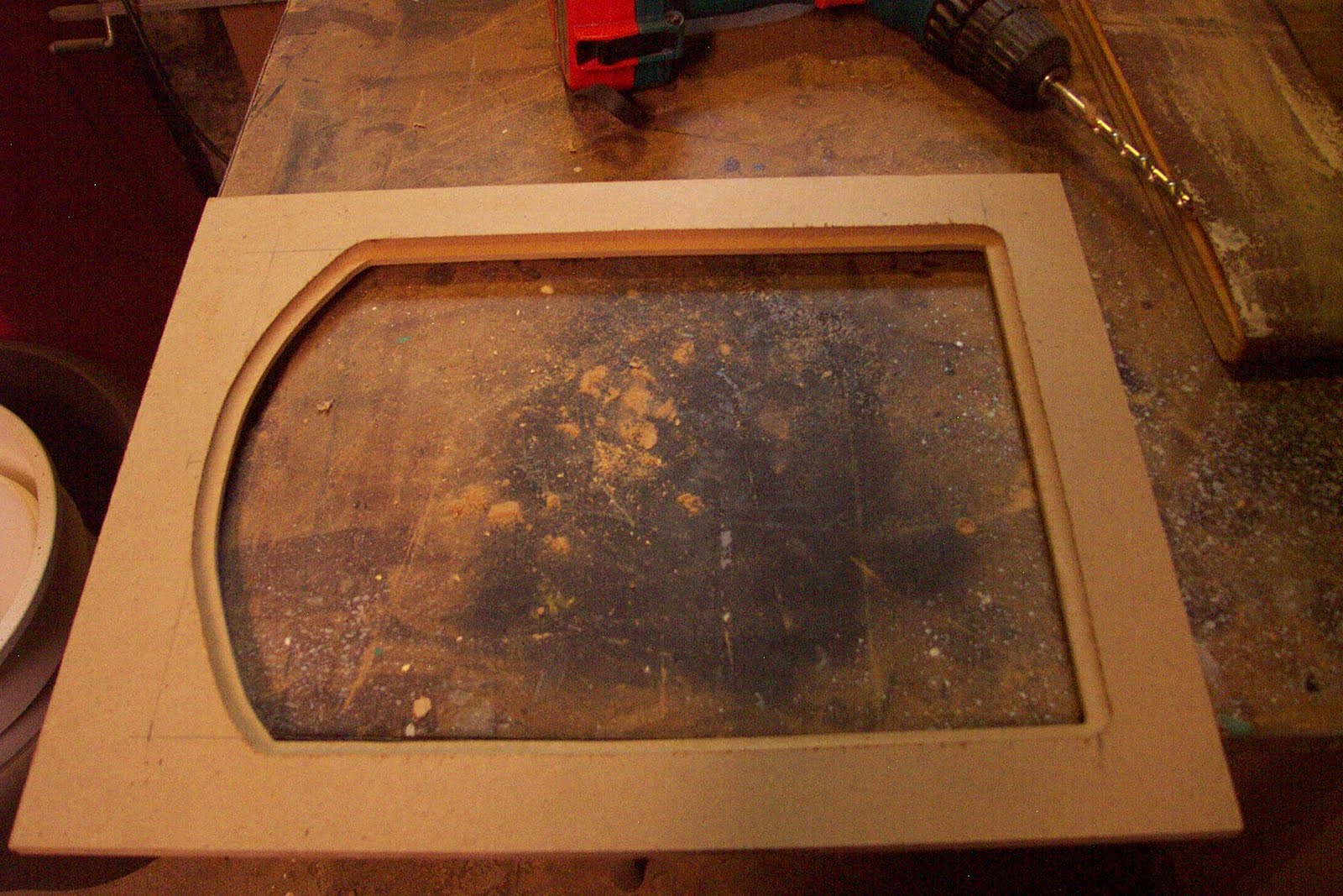
Basic idea here is to take a frame you already have, place a panel in the frame where the painting would normally go, then cut a new opening for a smaller picture. This can be done for any size or shape. This time we will be making an arched insert. I really enjoy the arched top paintings. It is a pleasant shape in which I enjoy composing.
If you have a lot of frames hanging around the studio this also opens up your options. Sometimes a frames is not quite the right size or shape. I have quite the collection of old frames and am adding to that pile all the time. Small paintings often feel better with a big frame on. So you can take a 6 x 8 painting, using one of these panels to add an inch all around, and now the painting and panel will fit an 8 x 10 frame (did that make sense?)

After showing the steps to make the insert I will show you how to apply a painted finish. One "do it yourself" frame finish I am almost always happy with is the flat black, hand rubbed finish. I will explain how that is done at the end of this demonstration.

Below is a frame I purchased for $20 at Castner Frames. It is for a 16 x 12 picture, the opening is 15 1/4 by 11 1/4. For my 13 x 9 painting with an arched top, this frame will work perfectly. I just need to make an insert. This is basically like making a fancy matte for a frame out of wood. While I am doing this for an arched top frame, it can be done for a square or oval picture.

Step one- Cut your insert:
I will start with a quote by Norm Abram, one of my heroes. "Before we use any power tools, let's take a moment to talk about shop safety. Be sure to read, understand, and follow all the safety rules that come with your power tools. Knowing how to use your power tools properly will greatly reduce the risk of personal injury. And remember this: there is no more important safety rule than to wear these — safety glasses." 

I have a 16 x 12" frame, so with the rabbit in the back I need and insert that will fit. Measure its exact size to be sure. For my insert I use a material called MDF (Medium Density Fiberboard). It is like a hard cardboard, made of paper fiber, wax and resin. It cuts like wood and takes paint well. You can buy handy 2' x4'  sheets at most hardware stores. For these panels I normally like to use 1/2" thick, but all I had was 3/4". Either thickness will work.
I cut a piece to fit tightly in the frame rabbet- make sure it is square (you can check the diagonals, corner to corner, making sure those measurements are equal). I used a table saw, but a jig saw will work. I penciled out the size and shape of the new opening on the panel, making sure to center it. I drilled holes in the corners big enough to accept the jig saw blade.


Step Two- Cut out opening:
I use my trusty Jig Saw to follow the line as closely as I can.

Step 3- Smooth the cuts:
Using wood files and sand paper (100 grit) I sand the cut edges smooth. This step is important, so spend the time to get this right. You want smooth edged and nice curve. The saw is not exacting and will need to be cleaned up. I have an orbital sander that helped  speed things up. Be careful to not sand at an angle or dig into the corners.
Step 4:- Route the edges:
You will of course need a router and a few bits. You need one bit for the  edge that meets the painting. I used a simple cove bit- shown below on the right. A rabbet bit is used to cut the space in the back of the panel for the painting to fit into. The 45 degree chamfer bit eases the outside edge of the back of the panel were it fits into the frame. This is not necessary, but since I had a larger 3/4 thick board it just looked better. Read all safety precautions when doing this step. MDF resins contain small amounts of Formaldehyde, so wear a mask with cutting and sanding.


If you do not have a router, you could probably file an edge on the front as a transition, and just use z clamps to attach the painting to the back without a rabbet. This will take some time to get your hand filed edge even, but it could be done.

Step 5- Chisel the corners:
The router bits are of course round, resulting in rounded corners. You can leave them, but I think it looks cheap. I use a straight edge to mark off squared edges and use carving chisels to cut them square. I first cut straight into the corner, with a straight blade. Next I carefully make slight cuts on the squared lines I drew. Use the rounded chisel to ease out the material from that corner until it looks like a smooth transition. Sanding is usually required to clean things up. Go slow, as it is easier to take off more than to add some back.


 Step 6- Suck it up and don't be a wuss.
Sorry for the graphic nature of the next image, but I want to demonstrate two things. One, that you need to be careful when using sharp chisels, always cutting away from your hand. Second, I wanted you to see what a total bad ass I am.
Did I stop here? No, I continued on like a man.

Yeah, Sorry about that Norm.

Step 7- Attach insert into frame:
You need to attach the MDF insert into the frame. I used pocket screws, being careful to not screw through the front of the frame. I have done this before. When this happens it is followed by about 15 minutes of profanity, and an extra 30 minutes of work repairing the frame. You can glue the insert in, use nails or just use z brackets as if you were putting a painting in the frame. I also fill the screw holes so it looks better. Not necessary unless you have OCD like I do. Finally, go over the frame, sand any sharp edges front and back, fill any holes and generally make sure the frame is ready for paint. I clean off any dust with a rag or tack cloth.
Step 8- Prime and paint:
I used Red Iron Oxide primer in a spray can to coat the frame. I suggest you do this step outside if you can. You will find any remaining imperfections after you prime it. You can fill and sand those and then prime it again. I usually paint the front and back making sure to cover all the edges. The MDF will suck up a lot of paint. Painting them will make the fibers swell on the edges a bit. Sanding and priming a few times will get them very smooth. After the primer dries (usually I wait 24 hours) I coat it with a fast drying ultra flat black. One trick I do, is to force the paint to crack. I like this look as it adds age and variety. If you want some cracked or wrinkled looked to the finish, Look for a can with  instructions suggesting you recoat it withing two hours or to wait 5 days. Paint will continue to cure even after it is dry to the touch. The paint is still uncured enough within two hours to accept a second coat. The paint will tighten and move as it cures for days. I disobey the directions and paint it after the suggested time. I wait about 4 hours and then spray it with a heavy coat, being careful to not get any runs. I paint heavier on the larger flat surfaces. This top coat which dries and shrinks faster than the under coat will start to crack in a few minutes. This is not an exact science, but it almost always works. I will say on this frame I got just a bit carried away. I prefer the cracking to be a bit more subtle.
 Here is the frame after a final coat. You can click for a close up view to see how the paint cracked.
 Step 9- Silver leafed edge and Final finishing :
I decided to add a silver leaf edge. There is a silver coffee pot in the painting so it will match. A leafed edge can help ease the transition from the frame to painting. I am not a leafing expert. This topic would require its own blog post. I suggest you look elsewhere for gold or silver leaf advice. If you want you can also paint the edge silver or gold. At times that looks almost as good.
I lightly sand the frame, especially the raised edges slightly to get through the black paint to the red primer. This gives it some age, distress and variety. The final step is to use butchers wax. Most hardware stores should carry the wax. Using a clean rag, I scoop up some wax, giving it a nice even coat. I then use Rotten stone, a gray powder used for polishing. I use that to dust the corners and draw around the edges with a brush that has been dipped in the power. Blow off the excess. After the wax as set up a bit, I take a clean soft cloth and buff the frame. It will get a very deep shinny finish. I leave the rotten stone in the corners. It will stick to the wax and give it an aged look that I like. You can see that powder stuck in the cracked paint as well.
 On the back I add the picture wire and the z clips for holding the painting.

Here it is all put together.
I really should stop making frames and just paint more pictures- but wasn't that fun?

Sunday, July 31, 2011

To Do List

The Late Night, 13"x9", oil on linen, 2011, ©Richard Luschek
I just finished this painting the other day and thought I would post some process shots. I am quite pleased with this painting. It has a very comfortable color harmony. I had an arched frame for this piece, though once again I did the painting out too close to the edge of the canvas, so the frame I had cut off some parts I was not happy with. I had to build a new frame for the painting. I will post the process of making the frame some time this week. 


The sketch:
I was up late drinking a lot of coffee. I like coffee, but this night it was to keep me fired up so I could get a pile of illustrations done on time. All my coffee cups were getting stacked up and I really like the rhythm they created. At first I thought the joy I felt from this visual phenomenon was mostly as a result of my caffeine overdose, but the next day after I got out of bed and returned to the desk I was still impressed with the arrangement. As I often do, I screamed out "I shall paint that!"
The next day in the studio I tried to recreate the scene. I enjoyed the curves and movement with all three stacked up, but was a bit much. I played around with a set up for a while till I got something I was happy with. I then did a color sketch on my Nintendo DS.

Day 1:
I am painting on oil primed linen glued to a birch panel. I set up the still life and was going to just dive in, but I got side tracked and had less than two hours to paint before I would loose my light. I decided to lay it in quickly using only burnt sienna. I don't usually do that, but I wanted to mass it in and I knew it would go faster in monochrome.
Day 2:
After it dried I made sure to go in on the second day and cover the canvas as best I could. I felt it was one of the better lay ins I had done- meaning, it had fairly accurate color and value notes and just enough drawing.

 Day 3:
A short day, just refining some of the forms and correcting the drawing.

 Day 4:
Bringing it into focus, I add details as needed. I had a group coming to the studio and I thought it would be fun to play a trick on one of my friends by adding an item to my "to do" list. I quickly painted "Kill Clem" on the painting. It was an hour into our sketch group before anyone noticed. I was thinking I should paint this message into all of my work.

 Day 5:
More finishing and refining. Of course I removed the "Kill Clem" joke and repainted the pad to get more of a light effect in the center of the picture. The coffee had evaporated and was covered in mold, so I cleaned the cup, added more coffee and repainted the cup on the right.

 Day 6- The Final Day:
I now decided I needed to finish the picture with some text. I made up a To Do list, wrote it on the pad in the still life and then did my best to copy it. I did not want the text to be readable, but to just appear as if it could be read. After this I realized the red vertical strip on the right was too dark and chromatic, so I lightened it a bit. Checking it for any other issues I realized the perspective on the cup was off. I repainted it again correcting the curves. A few tweaks and I had all I wanted. I then crossed this painting off my To Do list.

Friday, July 22, 2011

Death of a Modern Realist

Lucian Freud died this week at the age of 88.

During my time studying 'art' in college, Freud was one of two living realist painters we were encouraged to look at. Odd Nerdrum and Lucian Freud were two painters that managed to straddle realism and the modern in an art world  too tired and self important for truth in painting. Since I believed the sole purpose of art was a faithful representation of nature's beauty, study them I did.

While I must admit, after moving out of the study of 'art' and into my study of painting, I do not look at the work of Freud much these days. He was a realist for sure. His paintings are studies of life with crumbly, thick surfaces which are something to behold in person. You can see the journey, the study and the learning. He painted his subject warts and all. As a result he was a brutal painter. His work is often not pleasing. He never idealized his subjects, he painted what he saw. I think it is important to note that he did not refer to his models as "nude" but preferred the term "naked".
He was a hero for me in college, as living heroes were hard to come by. I still admire his work. When you look at a Freud painting you have to wonder if it is about the struggle the artist had visually or if it was something else in the painter. It is not surprising that the grandson of Sigmund Freud's would be so psychological but it often results in paintings that are not fun to look at. They tend to be confrontational and uncomfortable, much like listening in on a therapy session.

A few quotes from Freud:

"A painter must think of everything he sees as being there entirely for his own use and pleasure. The artist who tries to serve nature is only an executive artist. And, since the model he so faithfully copies is not going to be hung up next to the picture, since the picture is going to be there on its own, it is of no interest whether it is an accurate copy of the model. Whether it will convince or not depends entirely on what it is in itself, what is there to be seen."

"Painters who use life itself as their subject-matter, working with the subject in front of them, or constantly in mind, do so in order to translate life into art almost literally, as it were.....it is this very knowledge of life which can give art complete independence from life, an independence that is necessary because the picture, in order to move us, must never merely remind us of life, but must acquire a life of its own..."


Sunday, July 10, 2011

Bridesmade Revisited

My painting A Monster Attacks At Breakfast has been selected as a finalist in the Still Life/Floral category of The Artist's Magazine 28th Annual Art Competition. As a finalist my name will be featured in the December 2011 issue of the magazine.
So, that is three years in a row. It is of course an honor to be selected but I was hoping to win fabulous prizes. Oh well, there is always Next Year!

Monday, June 20, 2011

BS Creator

I was recently asked to write an artist statement for a show I was to be part of. I declined and just sent the painting sans statement-The work speaks for itself-  at least it should. I could write some flowery prose that speaks the obvious, but I am not one to do that sort of thing. I like subtlety and truth. Artists statements do not usually contain either of those things. I suppose you could argue that I am not writing a relevant artist statement then. That I should take the time to craft a statement that has all the things I cherish.
I have done so. This time I suppose I was just not in the mood. 

Someone recently sent me a link to the following website with an artist statement creator that I found pretty entertaining. I thought I would share. Now if such an issue ever comes up again, I can use this technological marvel to create my own.
Click the following link:
INSTANT ARTIST STATEMENT


Here is a photo of some terrible artwork followed by one of these "artist" statements to help you understand it. It works!
"The above work explores the relationship between acquired synesthesia and urban spaces.
With influences as diverse as Nietzsche and John Cage, new synergies are crafted from both explicit and implicit meanings.
Ever since I was a teenager I have been fascinated by the traditional understanding of the human condition. What starts out as triumph soon becomes corrupted into a cacophony of greed, leaving only a sense of decadence and the prospect of a new beginning.
As shifting impressions become transformed through boundaried and personal practice, the viewer is left with an impression of the inaccuracies of our world."

Sunday, June 12, 2011

William McGregor Paxton

I posted this article in another blog to which I will be an occasional contributor. I thought while I was at it, I would post it here. This is an article written by the teacher of my teacher, Paul Ingbretson. The author Gammell has written some great books of which I have mentioned here.


William McGregor Paxton
by
R. H. Ives Gammell

Les Poetes, devant mes grandes attitudes,
Que j'ai l'air d'emprunter aux plus fiers monuments,
Consummeront leurs jours en d'austeres etudes,
-Baudelaire, La Beaute

Introductory Essay on Impressionism

In 1977, as I write this introduction to a biography of William Paxton, a resurgence of interest in the American painters who were prominent during the closing decades of the nineteenth century and the first two of the twentieth is already under way. This entirely predictable revival conforms to a general pattern which has repeated itself again and again throughout the history of European art. When a succession of painters carried a particular interpretation of visual experience to a high level over a period of years, usually approximating three generations, there occurs a shift in esthetic values sufficiently marked to deflect the oncoming young into paths differing sharply from those followed by their immediate predecessors. The painters recently most admired are banished, contemned for a while and soon forgotten. Then, with the passing of another sixty years or so, the momentarily discredited school is brought out for reappraisal, their pictures are seen in a fresh light and each artist's reputation stands or falls in accordance with the actual merit of his work as that becomes apparent in the perspective of time.

The Crystal, 1900
Estate of the Artist

When the current manifestation of this familiar cycle runs it course Paxton will emerge as an arresting and significant figure. Historically his pictures will be seen as the ultimate and most uncompromising expression of the concept of painting which was reanimated in France during the last third of the nineteenth century. By the time Paxton returned from Paris in 1893 this pictorial orientation, now quite universally called impressionism by a usage which simply broadens the implications of a singularly felicitous word coined to ridicule the painters of Claude Monet's circle who were also working for similar objectives, was widely regarded by painters as the culmination of the art they practiced. Given its most complete expression in the art of Velasquez, who is still its greatest exemplar, its aim has ever been to convey on canvas the impression made on the painter by the subject he elects to depict. To the impressionist the splendor of the visible world as it appears to his sensitized vision surpasses in aesthetic significance and beauty anything that man can invent. His creed by no means belittles the essential role played by the artist in the making of a work of art, a role which is perceptible throughout in his selection, arrangement, emphasis and handling, but he never ceases to feel that the visible world before his eyes provides the surest guidance and criterion. From which it follows that the ability to see and to render truthfully the appearance of things is the prime qualification of the impressionist painter. After he has acquired the ability to do these things well, his stature as an artist will ultimately be determined by his personality. The training of painters in the western tradition was based on this principle from the time of Masaccio and Van Eyck until the twentieth century.

An aim of this book is to point out the role played by the impressionist attitude throughout the history of Western painting and in Paxton's relation to its last great flowering. For the art of painting can no more be divorced from its impressionist factor and survive than literature could continue deprived of the descriptive uses of language. When a vital element of a great art is momentarily abandoned because of some passing freak of esthetic fashion there is grave danger of its being irrecoverably lost before a reverse trend demonstrates its indispensability. Such losses have occurred in the past with lasting injury to the art of painting. And now today, in the nineteen-seventies the disciplined thinking whereby an artist is enabled to analyze his visual impressions and the complex procedures required to render those impressions on canvas are things known only to a handful of painters, and imperfectly known at that. It is reasonable to suppose that when painters of a future generation seek to rediscover, as they will certainly wish to do, the lore which made nineteenth-century painting possible, they will prize any information susceptible of facilitating their difficult task. To these searchers Paxton's pictures, and especially the thinking and the methods which produced them, should be of outstanding interest, for they represent the summing up of a movement which he understood with exceptional lucidity.

After all, the element in painting which we call impressionism is simply the pictorial expression of an artist's reaction to his visual impressions. The dominant characteristic of the painter, the trait marking him out from other men, has always been an exceptional sensitivity to such impressions. Whenever any painter transcribes a visual impression to paper or canvas, to that extent he is an impressionist. Obviously, then, all painters who have made representation a part of their aim have been, to some degree, impressionists. For many, rendering visual impressions was a minor part of their art or at most it remained ancillary to some other esthetic purpose. But others found the phenomena of the visible world so surprisingly beautiful and fascinating that they devoted their lives to rendering with paint or pencil what they saw, as they saw it, using the other elements of their craft to enhance their portrayal. Painters of this latter sort have now been designated impressionists because no other tide is so descriptive of their aims. To ignore or to belittle the esthetic value of impressionist painting is to reverse judgments which have prevailed over a very long period. To discard the working methods evolved by the impressionist masters is to greatly reduce the scope of painting as an art.

The essential characteristic of the impressionist painter is his attitude to what, in studio parlance, is often called nature. The word "nature" has long been in common use among painters to designate objectively observed aspects of the visible world. These aspects may be compared with an artist's representation of them and, when the representation differs from the thing represented, the divergence may safely be attributed to the artist's defective powers of observation, to the inadequacy of his rendering or to his intentional alteration. Nature provides the starting point of the rendering as well as a criterion by which the truth of the finished product may be judged. The general validity of this criterion has been accepted by virtually all painters of the Western tradition from Giotto to Cezanne. But the impressionist tends to place visual truth ahead of all other pictorial qualities. He does this because the beauty he perceives in nature seems to him of a higher order and of a more deeply satisfying kind than any other. Consequently nature remains his chief source of inspiration and his dominant purpose is to render as faithfully as possible, those aspects which stir him most. He realizes that an aspect is necessarily conditioned by its beholder, without whom it could have no existence at all. He is perfectly aware, too, that this subjective factor modifies his own observation and introduces an element into his rendering which is largely responsible for its artistic validity. So he strives to render his impression of reality, not to create a facsimile of it. But the true impressionist remains humble before nature. And the great practitioners have proclaimed that the more completely they gave themselves to the study of nature the finer were their results, as is attested by a considerable body of tradition based on letters, precepts, anecdotes and studio gossip, as well as by the published writings of painters.

Students of Western painting have observed that periods during which artists were greatly preoccupied with the direct study of nature have alternated with periods when artists fell back upon formulas of representation derived from the work of their predecessors. The nineteenth century, by and large, belongs in the former category. During its first half intensive study of form was carried to a high pitch under the leadership of Ingres and the academic painters of France. This academic art has been so frequently labelled artificial that few people today realize that the idealized forms which its practitioners introduced, when it suited their pictorial purpose, were arrived at by stressing typical structural shapes underlying the idiosyncrasies of the individual model and that this can be done effectively only by a painter who has acquired both a thorough grasp of structure and the ability to set down accurately what he sees. The best nineteenth-century drawing was based on the study of nature and it reached a very high level of draftsmanship. To appreciate this one has but to compare it with the draftsmanship of the late seventeenth and the entire eighteenth centuries until David.

But the chief contribution of nineteenth century painting was the renewed study of color which got under way in the sixties. Landscape painting and the study of color relationships observable in nature out of doors, as demonstrated by the group exhibiting with Claude Monet, brought a new element to the art of painting, an element which actually revolutionized that art and seemed at the time destined to expand its scope immeasurably. We have now so completely assimilated the discoveries of that era that people have forgotten their once revolutionary character. The change which they brought about in our perception of color remains especially evident, of course, in the painting of landscape. More subtle and therefore less perceptible to the untrained eye, but perhaps even more important in its effect on the art of painting, was the change in the painter's perception of flesh-tints. Because the human body, and especially the head, furnishes the most important theme for the painter's art, rendering the subtle and elusive character of flesh has ever been his central problem, the one which has generally been considered the supreme test of his craftsmanship. So a brief examination of the development of flesh painting should lead to a better understanding of the impressionist attitude and of its esthetic contribution.
Painters working before the fifteenth century were content to fill in the outlines of their figures with a conventional tint which could be identified as indicating flesh. Presently the Van Eycks and their followers in Flanders and men like Piero della Francesca in Italy made great advances in this direction. These painters evidently mixed their tones to match actual flesh in light, adding brown or black to suggest the shadows. A little later Leonardo contributed to the understanding of visual impressions by demonstrating that the shadowed parts of an object were those which did not receive direct rays from the main source of light and furthermore that the points at which those rays ceased to illuminate always formed a perceptible line of demarcation between the lighted parts and the shadows. This seemingly self-evident observation constituted probably the greatest single step ever taken in the slow development of man's perception of how things appear to him.

For a time painters merely assimilated Leonardo's discovery with their established practice of coloring flesh. They now set down the shadow area in its full degree of darkness and differentiation, but they made it with a brown or blackish tone which Varied with the individual painter rather than with the lighting conditions of the particular - painting. Indeed, it is notable that very little advance was made in observing the true color of flesh in shadow until the late nineteenth century. But certain colorists began to note the subtle shifts of color observable in flesh in light. The evolution of their observation edged away from a warm tonality toward the balance of cool, pearly tones which we now recognize as the characteristic color of flesh in ordinary daylight. It is fascinating to trace this evolution in the work of the great colorist-innovators, Titian, Veronese, Velasquez, Vermeer and Chardin. The extraordinary distinction of color attained by these painters, of which their treatment of flesh is an outstanding factor, is sufficient proof of the esthetic value of their achievement

The great change in perception of color which took place in the nineteenth century was primarily due, as I have already indicated, to the vogue of plein-air painting. The effort to render brilliant light effects, and especially sunlight, forced painters working out of doors to study color relations as they had never been studied before. Their researches led to the adoption of methods now familiar to all, such as the use of more or less pure tones in juxtaposed touches. Although the more extreme of these methods soon fell into disuse they served to make painters aware of color variations to which they had formerly been blind and this awareness came to be partially shared by the public. Plein-air painting became a necessary part of the professional painter's training and the acuity of vision which he developed out of doors affected the work he did indoors as well. He saw that things were colored very differently from the way they had previously been depicted and that they looked vastly more beautiful and exciting to the eye. Small wonder that the painters who were young during the eighties and nineties felt that a new world of painting had opened before them in whose untrodden paths they were destined for great adventures. Yet in less than sixty years the movement engendered by the new perception had petered out. A new generation of painters repudiated its objectives and dismissed the great traditions, visual and technical, from which those of nineteenth-century impressionism had been derived.

Why did this happen? It is sometimes argued that nineteenth-century impressionism destroyed more than it came to fulfill. For reasons inherent in the social and artistic conditions of the times, impressionism developed in opposition to the so-called academic painting, whose erudition and traditional craftsmanship the impressionists attacked and eventually discredited. By so doing the innovators cut themselves off from a vast body of knowledge which some few of them could afford to ignore as individuals but which the art of painting could not dispense with without serious injury to its development. Another causative factor of its early decline lay in certain characteristics of the movement itself. Absorbed as they were in the study of color, of light and of atmospheric effect, the impressionists tended to neglect the study of form, a neglect which resulted in the rapid deterioration of their standards of draftsmanship. Moreover, their emphasis on the immediate impression, on direct notation in the presence of nature, often under uncomfortable working conditions, led them to improvise the composition of their pictures, thereby discarding the carefully considered preliminary studies of their predecessors. Furthermore, this art of observation and interpretation turned its back on the imaginative side of painting. A movement which should have greatly increased the resources of painting, enlarging the scope and possibilities of the art, by cutting itself off from the central tradition of which it was an offshoot, brought about its own decline. The painters who grew up during the earlier years of impressionism and who therefore still benefited by the broad and sound training of the old schools produced fine pictures, but each succeeding generation gave evidence of an ever narrowing outlook and of a weaker technical equipment. By the nineteen-twenties the prevailing concept of painting had become so limited and its techniques so feeble that a violent reaction of some sort was inevitable. It gave us Modern Art.

Nineteenth-century impressionism will always be studied for the great pictures that came out of it. When the sterile representational conventions in vogue at the present moment are outworn, painters will turn to the great protagonists of impressionism in an endeavor to rediscover the lost art of painting. They will study the nineteenth-century painters for the skills which were their special province. But .the painters of the future will also study nineteenth-century impressionism as a step towards understanding the still greater impressionism of the seventeenth century. It is a hopeless task to emulate the great masters of that time without first acquiring the more readily accessible knowledge of the recent painters who best understood the objectives of their great predecessors. This has been abundantly demonstrated in our time by the persons who profess to paint "in the manner of' one or another old master but who are quite incapable of making a passable rendering direct from nature. Their would-be pastiches of the old masters are acceptable only to themselves and to their disciples.

The pictures, ideas and methods of William Paxton should be of exceptional interest to future students. In several respects his position was unique. He received his early training at a time when drawing was still insisted upon and he was well taught. His first teachers were Dennis Bunker and Jean-Leon Gerome. Their training, superimposed upon his remarkable natural gift for drawing, enabled Paxton to retain a sure grasp of form while pursuing the most subtle color effects. He thus escaped the major defect which too often mars the pictures of his contemporaries. By temperament an impressionist and living in a period when the impressionist ideal was universally accepted, Paxton dedicated his powers to setting down on canvas the beauty he found so stirring in nature, which he looked at with eyes of very exceptional sensitiveness and accuracy. It is not an exaggeration to say that he accomplished his object more completely and faultlessly than any other painter who worked in the color-scale evolved in the late nineteenth century. Paxton's pictures may be taken as examples of the ultimate limit to which that kind of painting can be carried.
Cherry or The Gay Nineties, 1906
Estate of the Artist

As a conclusion to and a commentary on the great impressionist movement of the nineteenth century Paxton's pictures are eminently worth studying. But they will also be highly prized as paintings. When an artist has been deeply moved by some aspect of life and has devoted his energies with undeviating sincerity to expressing his reaction to that aspect and when such a man also succeeds in giving to his expression an artistic form of great technical perfection his pictures are sure to hold the enduring interest of posterity. The principle will hold in William Paxton's case as it has in others throughout the history of painting.