Sunday, October 25, 2009

Painting Breasts on Bricks

Today is the 8th annual Breast Cancer Brick auction. I did a brick for the auction and I think you should go down there and bid on it.
Sunday, October 25th, 2009
2-5 p.m.
Mayerson JCC
8485 Ridge Road
Cincinnati, Ohio 45236

Here is my brick:
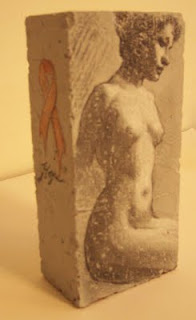
I decided to do this kind of last minute, as I was asked to do one after the deadline for submission. The weird thing about it all is that on the day I decided to do a brick I heard from someone that after a long absence. She had been having her own battle with breast cancer and is still struggling to get better. She is in good spirits but this really hit home the importance of finding a cure for this disease.

I started my brick the night before I was to turn it in, I did not have time to get too creative and used it as a chance to do a copy. I wanted the brick to show the beauty of the female form, and since I was reading through a book on figure drawing by Vanderpoel, I thought some of his work would be perfect. The only requirement is that the brick have some sort of artwork on it, and that it have the symbolic pink ribbon in it somewhere.

Before I get asked about why we are painting on bricks, the auction was started by a cancer victim that said when she got cancer it was like being hit with a ton of bricks, so since that time they decided to decorate those bricks and auction them off to raise awareness and money to fight for a cure.

So, go buy a brick.

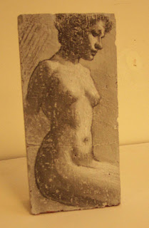
Now, about my brick and the drawing I did on it. I primed the brick with gray alkyd house primer, and then did the drawing using charcoal and some chalk for the white. The brick surface was kind of interesting to draw on. It definitely was an nice texture to work with. While I am at it, I thought I would use this as an opportunity to talk about Vanderpoel and what I think makes his work special.
It is tough to find out much about Vanderpoel. There is not a lot of work available to see other than the drawings in his book.


The Human Figure

The Human Figure (Paperback)

~ John H. Vanderpoel (Author)
4.3 out of 5 stars See all reviews (27 customer reviews)

List Price: $6.95


Vanderpoel was very respected teacher that taught for 30 years at Chicago's School of the Art Institute. When he died in 1911 he was so loved in the community that both a school and a street were named after him.
He taught a lot of students including George Bridgman. You maybe be more familiar with the Bridgman books on drawing the figure, a teacher at the Art Students League in NY. It is Bridgman that is often sited and mentioned by artists today as being helpful and influential.
I have never really understood the fascination with Bridgman. He books are almost unreadable, and the illustrations look like a close up of car parts rather than anything having to do with the beauty of the human figure. He has stylized and picked apart the body turning it into a machine of pulleys and levers. Now, this information maybe more helpful to those that draw away from nature, making up their figures- building them like machines. I think that often when one considers the parts before the whole of the figure you can easily miss the beauty.
I have made the case many times that most college art courses teach the absolute opposite information needed to be a good painter. They teach one how to see the differences in things, how to separate the parts. Draw the fingers then the hand. While anyone that understands painting knows it is the wholeness, the unity, the similarities in things that are often what is so lovely about nature.
My point is that if you think your goal is to make art that is beautiful, you would go a long way to study artists that understand that, like Vanderpoel. You can see from the drawings in his book that it is about simplicity not complexity. About subtlety not detail. An important part of that one can study is the flatness of shadows and the form fully rendered in the light side of the subject- No forced reflected light- No looking into the shadows. Have a look at Vanderpoel's book, and see what I mean. These are poetic drawings and they are breathtaking.
I own the Bridgman books on drawing too, but when grab a drawing book I always grab Vanderpoel off the shelf first.
Here is a better view of my brick. I am doing this post a bit late as the auction started 10 minutes ago. Make you way over there and place a bid.


Saturday, October 17, 2009

Crossin' The Mississippi

You may remember the post about the group of fine ladies that came to Cincinnati and did a Still life workshop with me.
Despite this experience, they invited me to come to Iowa to teach a 3 day Landscape painting workshop. The organizer, Pat Bereskin has an art school in the Bettendorf area of Iowa. With over 100 kids and some adults taking her classes at any given time, she is offering some amazing exposure to the arts, with various lessons, trips and guest artists. I don't want to put words in anyone's mouth, but I get the feeling that I am their absolute favorite guest artist from the Clifton area of Cincinnati who has a beard. I can only assume they like me because of the vast amount of information I bombard them with, or it may be due to my rugged handsomeness and charm. We'll assume it is both.
So my wife and I drove to Iowa.

I am ashamed to say that this was my first time crossing the Mississippi. I have been in most of the states east of Cincinnati, but I have rarely ventured west. Being my first time in Iowa, I must say it is a fine state. While it is very flat, there are some wonderful vistas for landscape painting- miles of corn filled fields and farm houses. John Deere tractors are everywhere. My first 'job' when I was a kid was to work in my great uncle's John Deere dealership in Hillsboro, Ohio, so while I was in Iowa I bought a JD hat just to show my loyalty.
Here is a photo of my lovely wife and I being welcomed to the 'Food Capital of the World'.Please note: this photo has been adjusted in Photoshop because I blinked.

I am not sure I would suggest organizing a landscape painting class in the middle of October. It was unseasonably cold in Iowa for early October. One thing you don't want hear on the radio when you are driving into a city you are visiting is the phrase "Arctic Blast". Even with the cold, the class went quite well. It helps to have a smart and attentive group to work with. I did a lecture and brief painting demo- during which I did the best painting of a stuffed turkey I have ever done.
Stuffed Iowa Turkey, 7"x5", oil, 2009

Even though there were tons of lovely views, it is hard to find a spot for 10 people to stand that happens to be near bathroom facilities. We ended up working in two local parks. The second day was a bit more successful. The weather was better, and the view was more typically an Iowa landscape with a long, open horizon. It was a much simpler subject for the beginning landscape painters. The class was mostly beginners, some had never painted before.


This class was pretty much about doing landscape sketches rather than finished paintings. The idea of a sketch is to get the basic value, color and look of the day, with a little bit of drawing that is relevant. A sketch can be done with some skill to have the look of a finished work, but often they either need to be worked on again, or are to be used a reference for larger, more finished works.
Pat and her group of painters plan on working on their landscapes from the workshop after I have safely left the state. I am going to offer some suggestions to them and to anyone that might be interested in how to work on a painting after the initial lay in. I know they plan on working on them in the warm of the studio, finishing them up from photos they shot before we left the location.

Let's discuss the desire and tendency to work on the sketches after the fact- from photos.
Of course I generally do not condone working from photos. It is easiest to get the look of nature by actually being in front of it. Photos are big flat liers. They lack form, good color and accurate values. You will get false results if you rely on photos.
I suggest you return to the vista, same time of day, same kind of weather (it can be warmer) and same light effect.

But......
If you are going to use photos, think of them as tools, not as a replacement for nature. Use photos as a reference or slight reminder for the impression that you hopefully have some memory of. The sketch was your attempt to get the impression, now you need to keep that impression and improve any issues that the sketch may have. Your notations of color from nature are going to be more accurate. The photo may show you some proportion errors. If the photo is shot well, it may hint at some value problems as well, but be careful as often a photo will exaggerate the value range- darkening the shadows and brightening the lights. A camera will also exaggerate edges by seeing them all equally. Standing back from a tree, a camera will record all of the leaves, whereas the human eye can really see only a few dozen with any clarity. The rest evaporates into a blur. We can see that leaves are there, but can not make out any detail. Most good painting will replicate that effect. If one goes in and renders all edges equally, it destroys focus, evaporates atmosphere, and makes the image appear harsh and photographic. So, when working from photos, make sure you do your best to not stupidly follow a print-out of a photo taken by a machine that happened to be pointed in the direction of your motif. Look at the photo with a squint or blurred eyes as you would the actual scene and maybe you can keep yourself from being a photorealist.

How do we go back into a painting?
It seems most people think paintings are done in one session. Rarely is this the case. To get any kind of finish on a painting, one must keep going back in, correcting and refining. I would say the typical portrait may have as many as 20 or so 3 hour sittings with the model. When working on a painting think of it as if you are doing a series of 'coats'. You can of course finish a sketch in one session or one coat, but most fully realized painting have a number of coats.

It is not recommended that you do not work on a sticky painting. It's an unpleasant surface that is like painting on glue. Make sure the painting is either wet from the previous day, or wait to go back in after the painting is completely dry. In the summer I often set landscape paintings in the sun to dry so I can be sure I can work on them the next day. The dash board of your car can be useful for this.

The most important thing I want to mention is the idea of painting wet into wet. If you are not painting wet into wet, you are not painting. If you are working on a painting again, you have to work with all wet edges. Meaning, when you stand with your palette before a dry painting and you decide to work into an area that has a blue mass adjoining a red mass, if you realize that the blue mass needs to be moved to over a bit, you need to get both the blue and the red areas wet to really paint that edge. Don't just paint the blue edge into the dry red area. This is not painting. You want the edge to be wet so you can accurately render it.
Once you start in on a dry painting, you should of course attack the 'back straggler'- the thing most off or lagging behind. Go into that area, restate all the major color units by getting them wet, making sure to do any correction to shape, value, color and temperature while you are there. Once the area is wet you can start pushing the painting forward- correcting and improving.
This does not mean that the entire painting will get wet every time. The first day you goal is to cover the canvas. The second day you must improve on the first day, which may involve re-wetting everything again. As the painting most ahead, smaller and smaller areas will need attention. You may just wet a quarter size area of the canvas that needs some adjusting, but in that area, you have to get all relevant areas and edges wet.

My final suggestion actually came up recently during a studio visit with one of my private students while she was working on still life painting. She had been working on her painting that day, and when I grabbed her palette to make some corrections on the painting, I realized she had only put out a few colors, in the 'local color' family in which she was working. To explain that better- she was only working on the orange flowers so she only had yellow and red out. This is a major no no!
Always work with a full palette. I already recommend a pretty limited palette, but it has everything you need to hit the "note". Think of it this way, if you are going to compose a musical composition in the key of F you would not just work on a piano with on the F keys. You need all the other keys to compose a song worth listening to.
Any given color that we paint may have some amount of red, yellow or blue in it. So, you should at least have those three, with white. To decrease the intensity of a red- a blue, a black or especially it's complement- green may be just what you need. Without them you are just making it harder on yourself. Fully loaded does not mean you need all the blues and all the yellows and all the reds, but you should at least have one of each of the primary colors.
Make sure you always paint with a fully loaded palette!

Sunday, October 4, 2009

Framing and Asbestos

First I want to mention a slight improvement to the blog. I have added labels to the posts so when you come to this blog and would like to read all of my harsh comments concerning terrible "art", you can go to the labels section, click Review and Criticism and get a list of all posts under that topic. It is pretty cool. It would have been much cooler if I had been doing it all along as now I am going back to old posts to get them labeled. This post will be labeled under Framing.

One could say that I am a bit too fascinated with frames. My wife is always telling me to stop working on frames for my pictures, and go paint some pictures to go in frames that some other person, namely a frame maker, will produce for me.
Of course she is right, but I do enjoy tinkering. I admit it, I am a tinkerer.
I thought I would share some of the techniques that I have worked out on building and repairing old frames.

Painters are always on the lookout for good frames. I have piles in my basement- old frames that I have found in the garbage, frames that people have given me, or that I have purchased in yard sales or antique stores. You can find messed up frames pretty cheap if you are willing to do some work yourself. Have a look at my pile- it is a bit sick really:

You can click on all of the images to make them bigger for a close up look.


One corner of my basement


The next room


Turn around and you see this.
As you can see, I have a few frames, and should probably paint some pictures to fill them.

The purpose of a frame is to set the painting off from its surroundings. Another reason for a frame is to protect the painting. Sometimes while performing this action, the frame can get pretty beat up. As they age, they dry out, chip and crack. I prefer antique frames. They were usually designed well and often have a lovely patina that adds some history to the painting.

A good friend brought me a damaged frame she wanted my advice on. Her mother gave it to her and she wanted to restore it. It was missing a bit of its fanciness, and had some bad repairs done to it. I told her I would have a look. She is doing a fine job reworking my website so I decided I would fix the frame for her and post the steps here.

Typically a frame is a wood molding. Any designs are either carved into the wood or applied with some sort of plaster compound. Often if the frames are old or have been mishandled, parts of this applied decoration have been knocked off.
My opinion has always been to do your best to keep the look of the old frame and then try to get the fixed areas to look as much like the old as possible. While I am not a restorer, I don't use traditional materials, as they are usually difficult to handle, and I think some of the newer products are just as good.

Now, I had already done much of the work before I decided this would be an informative blog post. I will just go through the steps here.
First- remove any bad repairs on the frame. One this frame, someone had tried to fix some of the missing molding with what looked like chewed bubble gum. I scraped it off.

The frame is laid out, all the loose pieces are taken off, cleaned up and can be glued back on with any good adhesive.
Here is the frame, after I fixed the areas- for sake of demonstration purposes, imagine these are nasty gaping holes. My guess is this is from the 40s or 50s. It is a nice frame, probably pretty typical. It is not a finish corner frame, meaning the molding was just mitered and nailed together. It is very pretty and should be fixed.

What do we need to do this job?

Non hardening Clay- Plastina, a sharp knife, a small hand saw, a sanding block with rough paper (80 - 100 grit) and some finer sand paper. Glass of wine is helpful- I was drinking a nice Shiraz. You will also need a material to cast your new pieces of molding. I have used many things for casting these pieces in the past: Plaster and Bondo. This time I used Durham's Rock Hard Water Putty. It worked very well. There has been some discussion, and even some law suits about this product having a bit of asbestos in the ingredients. I think this is overblown. It is in small amounts, but I suggest you wear a mask, as you should with any powder product. (Pretty soon the government will force us to wear helmets and padding so no one ever gets hurt) I also suggest you not eat or drink a fine wine around it like I did. You can get most of these things at a hardware store or good art supply store.

First step is to get a sample of the molding. You have to do a press mold off a good section of the frame. Knead the clay till it is soft, and then press it on the frame. Cover an area that will give you one piece that will match up to what is existing.

I pushed it on the frame, near the area to be replaced. Then I carefully pull the clay off.

Admire your work and have a sip of wine.
We have a mold in which to pour our putty. Try to make sure the mold is straight and not stretched or deformed.

You know, I have lovely hands. I really should be a hand model.

Don't forget your dust mask. Scoop some powder into a cup and slowly add small amounts of water, stirring till it is a thick paste. If it is too watery add more powder. It is forgiving.

I use a soft brush to push the paste into the mold. Tap it on the table to get bubbles out. Once it is filled I set it aside to dry- overnight is best.
Do all of the missing pieces at once.

The next day you can pop your new piece out of the mold. It is tough stuff, but try to not break it as working with one piece is easier. Now you just have to clean it up and fit it to the space.
Sand it on the block, Get it flat and remove the excess pieces.
Take your piece, that should be slightly larger than the space it is to fit in, and mark it with a pencil. Use a fine saw to cut the piece. You can often just cut half way, then break it on the scored area.
Check it for a tight fit, make sure the molding pattern lines up and is in the right order. Sand or trim with a knife till it fits tight. If it is a bit loose that is ok, you can fill the spaces. Now, mix up more putty, a bit wetter, butter the back of the piece thickly, and press into the space. Wipe off any excess that squeezes out. After this drys you can fill any voids with more putty, a brush or spatula. Use the knife to carve a smooth transition- a utility knife or Exacto blade works well. Sand lightly if needed, making sure not to lose any detail in the design.
Now we have to get the finish to match. This one will be tough, as it is old metal leaf that has a bit of age and tarnish on it. I am just going to use some gold spray paint to cover it and get me in the right direction.
I spray the paint into a cup and carefully brush it on the repair. I will let this dry and then try to get the color and patina later. I may have to metal leaf it next.
Here is the frame with the pieces all painted gold. You can see the decoration is pretty continuous, and integrates well. Once there is a color match, it should look good as......old.